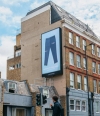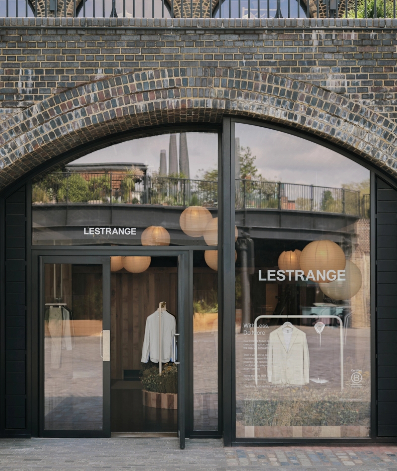
NEW STORE OPENING: KINGS CROSS
NEW STORE OPENING: KINGS CROSS
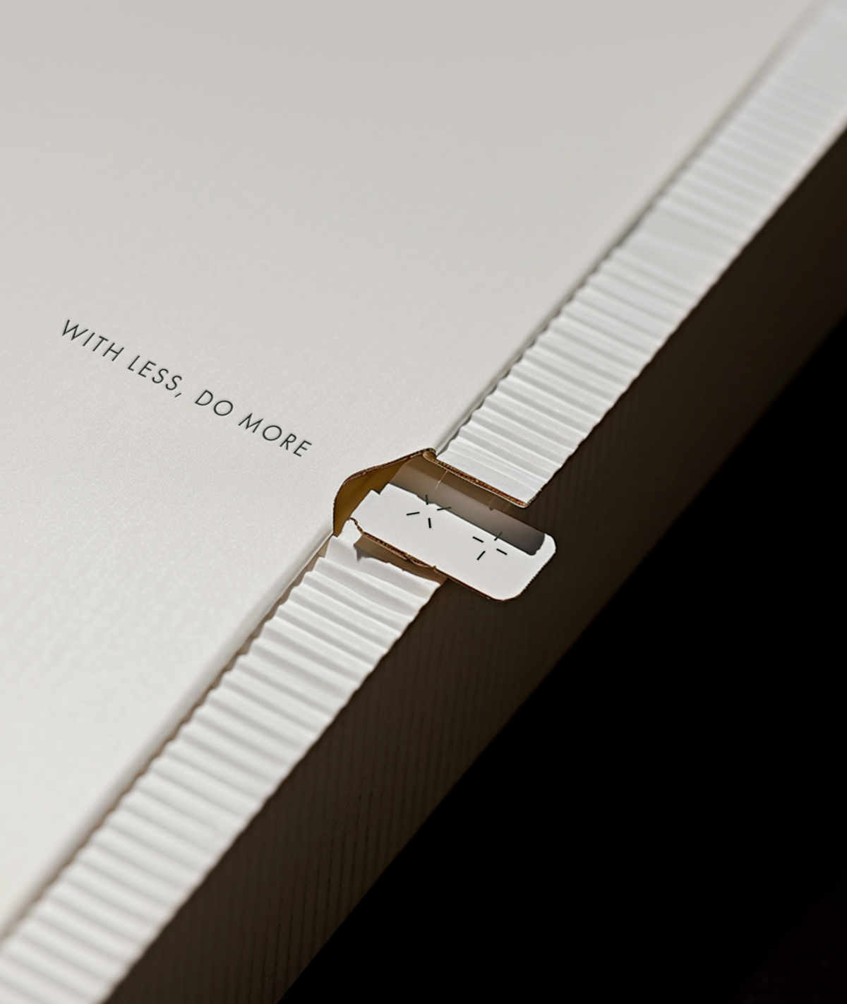
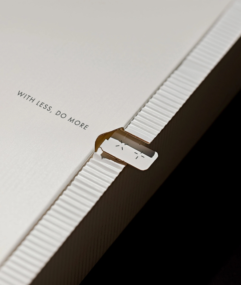
Taking inspiration from the modular approach of clothing that is so innate to Lestrange, we applied this as a fundamental in our design thinking. Our brand identity focuses on anchoring design elements such as ‘material swatches’, to give homage, to educate, and to make more obvious the brand’s purpose: in owning less pieces, and making them do more, at a higher quality.
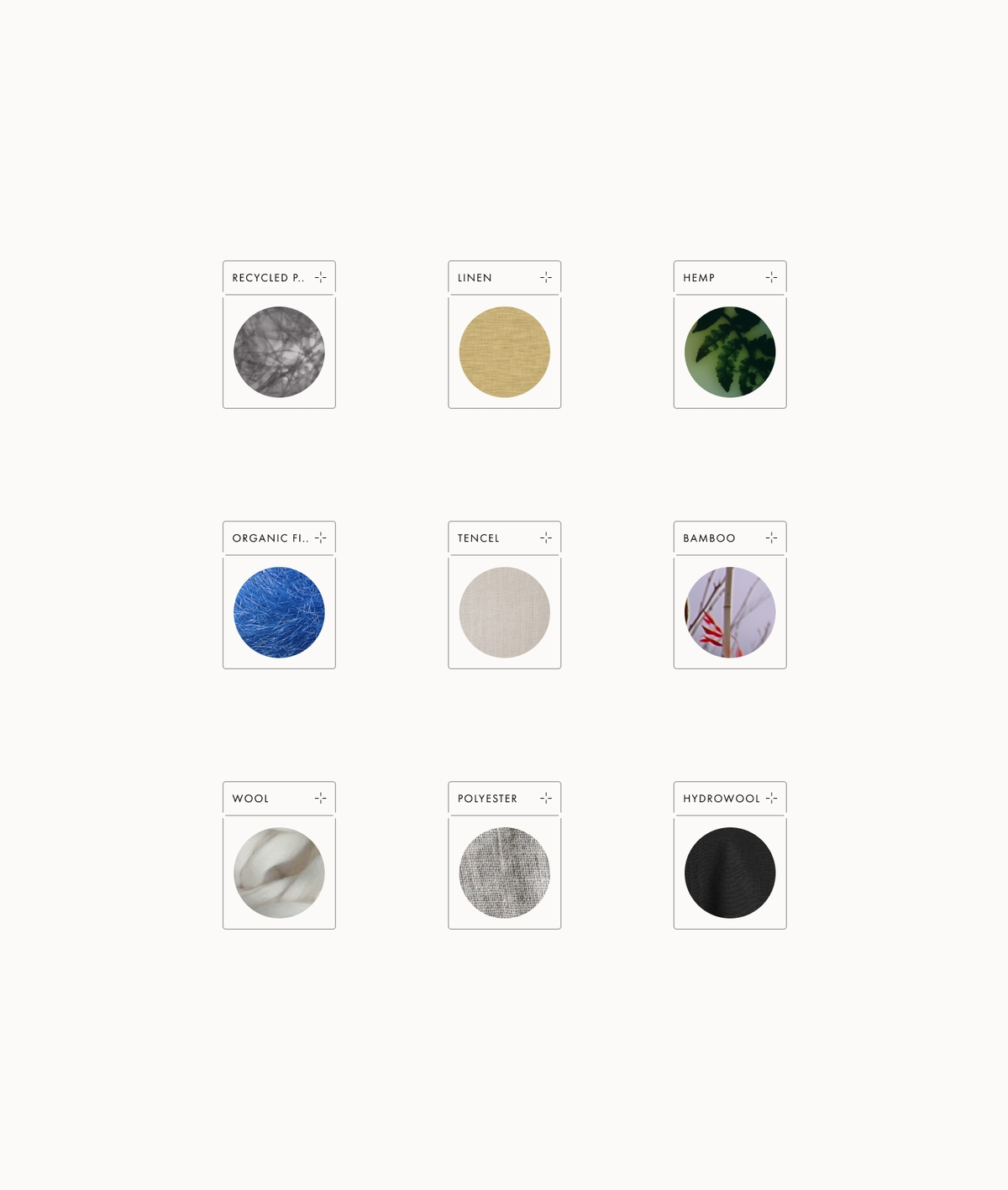
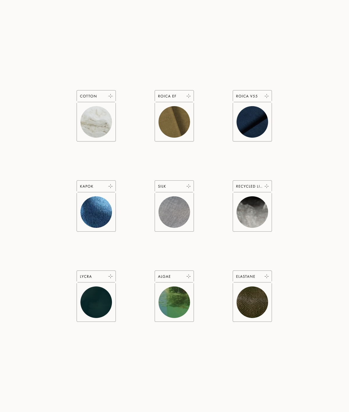
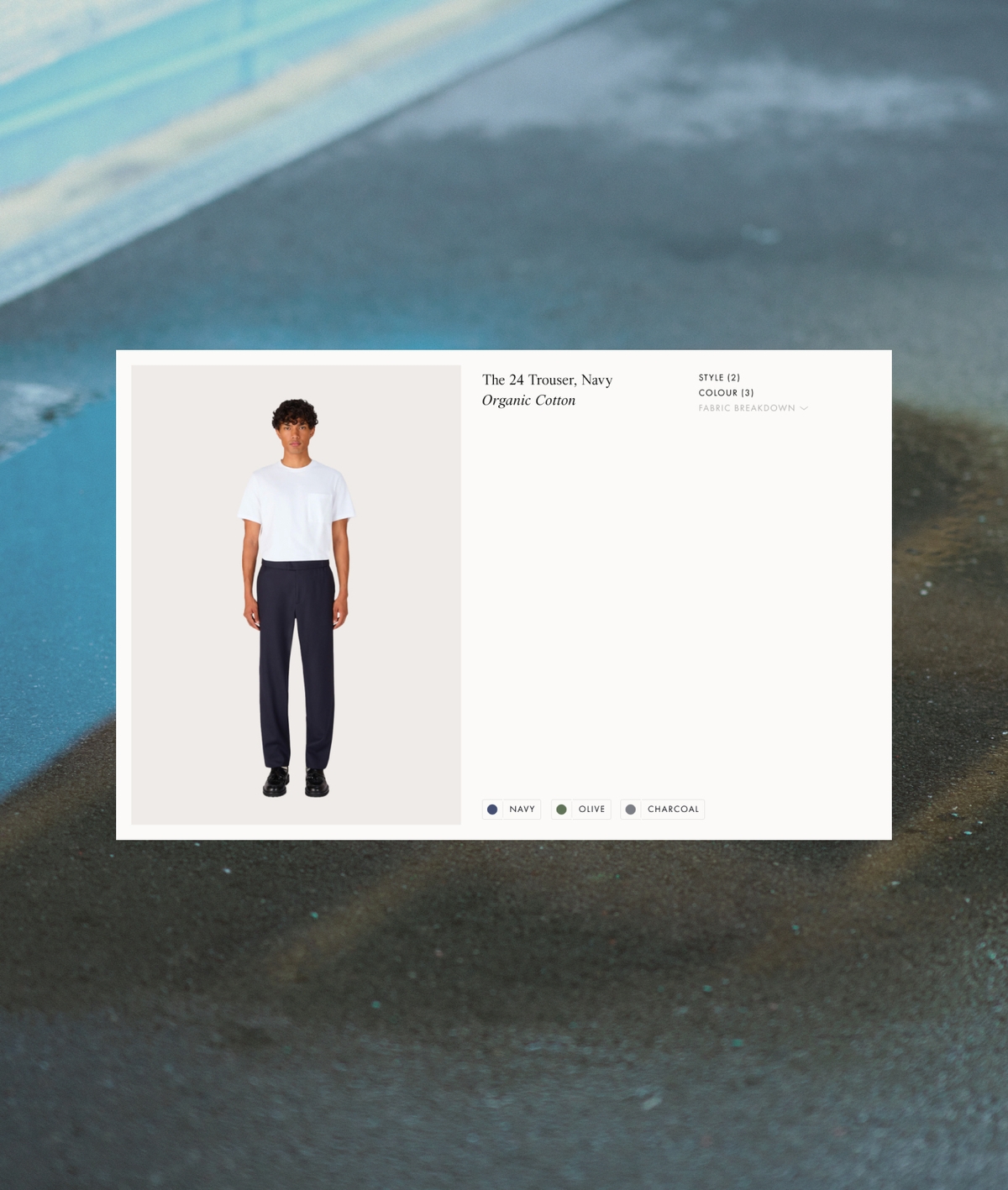
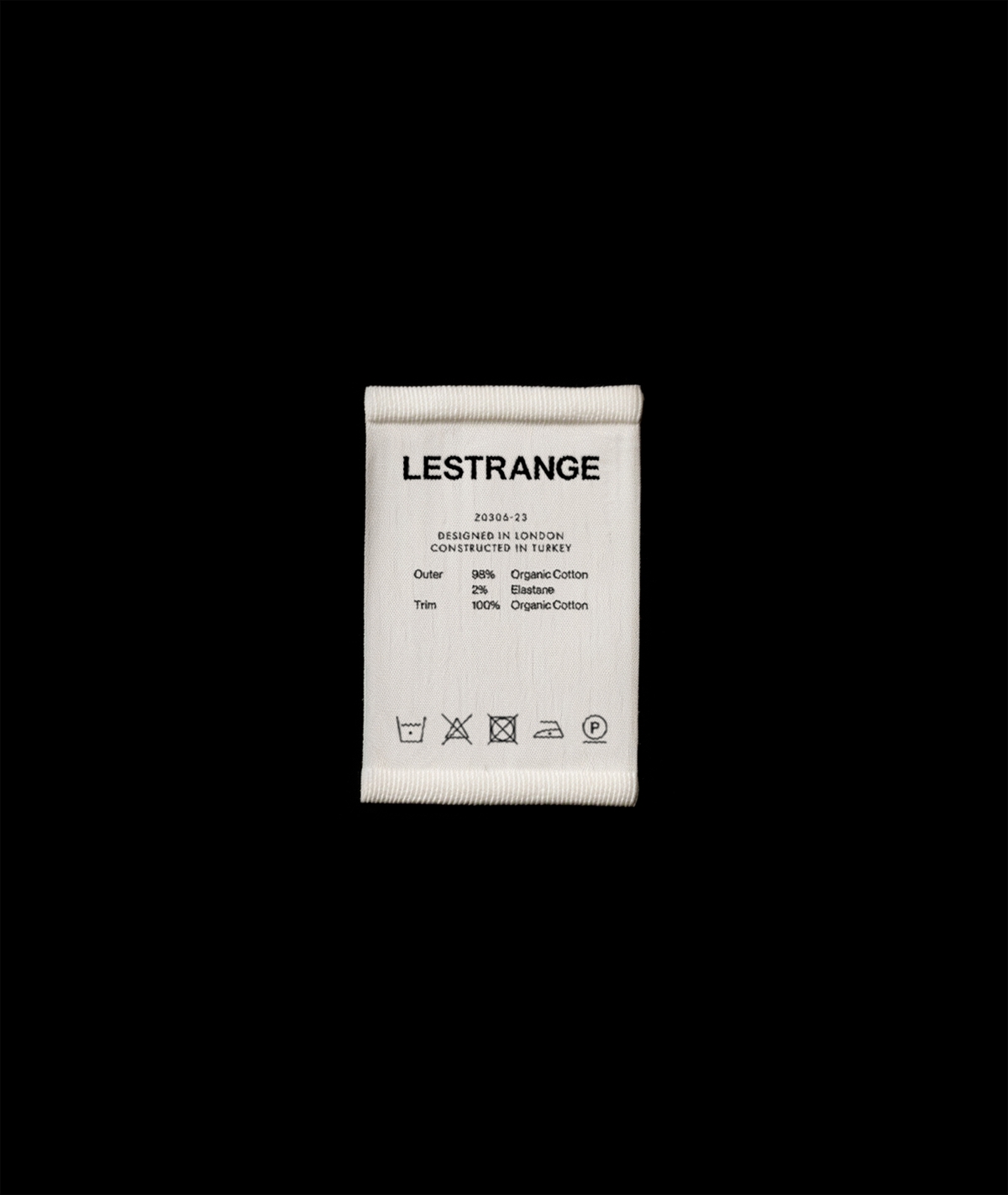
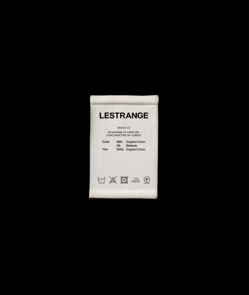
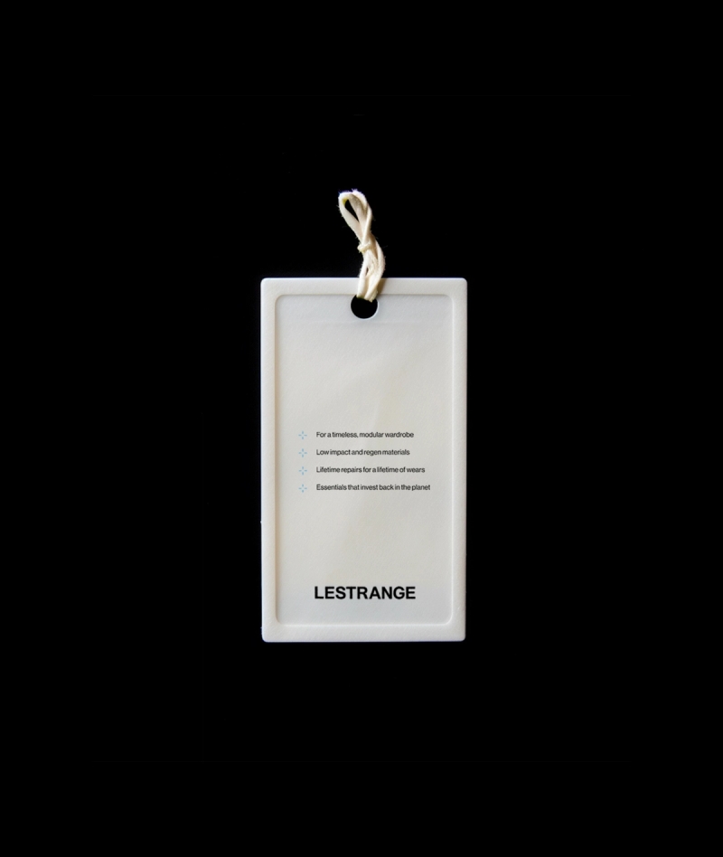
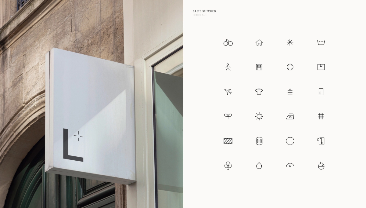
As an essential building block of the brand identity, our ‘material swatches’ root our modular approach, and serve as interactive entry-points to discover new pieces within the Lestrange range as well as understanding existing pieces you own and their care.
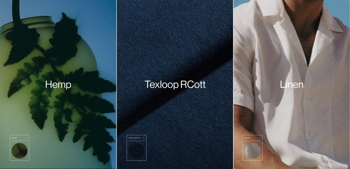
Material swatches serve as content opportunities, enabling the brand to showcase backend production processes and integrate impact-driven, environmentally textured photography. This allows for a more expansive and conceptually rich art direction.

Holistically, we prioritized creating an immediate consumer-friendly first impression and a quick understanding of Lestrange’s niche, quality, and price point. Our brand approach strikes a balance between fashion and lifestyle; refined but accessible.

Elements like ‘baste stitching’ icons, originating from our new logomark, extend seamlessly to icon sets and UI in digital applications continually conveying the concept of -less and +more.
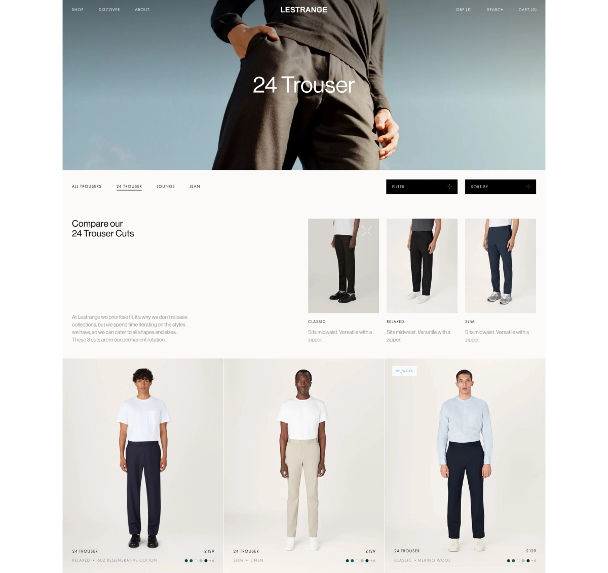
Our material swatches play a key role in shaping the SKU organization and sitemap restructuring for Lestrange's new website, offering a focused strategy for content and product catalog management.
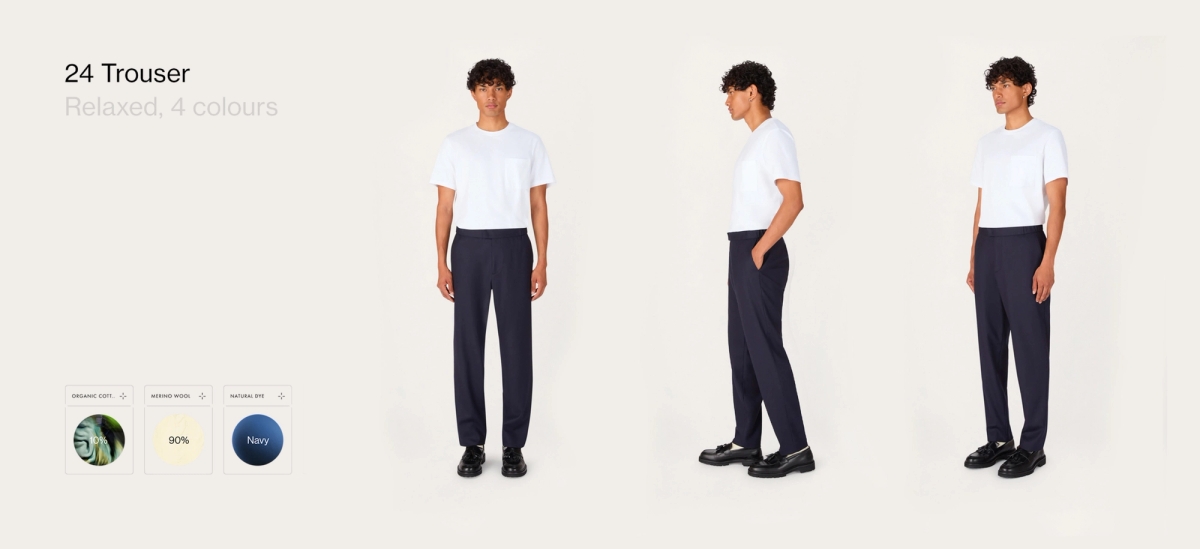
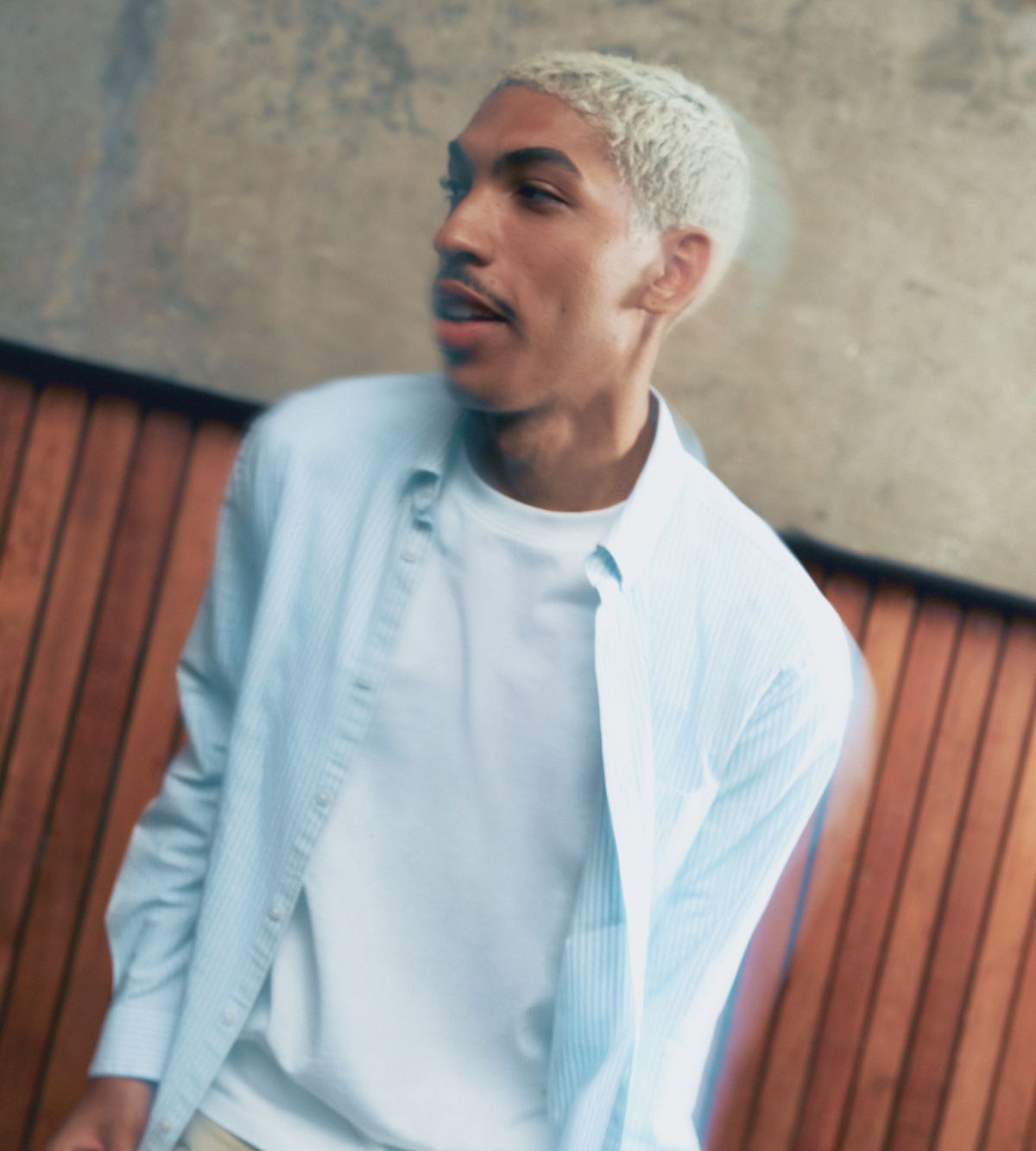
With a complete redesign and restructing of Lestrange's website, this included a new art direction for ecommerce photography, showcasing pieces as fashion-forward and refined. Seamless integration of video content added 'windows of surprise' within clean and static imagery, providing consumers a deeper understanding of fabric movement, fit, and intricate details.
The concept of modularity here is expressed through a sequential direction where a string of ecommerce images can be placed next to one another and give an impression of frame by frame movement and walking.
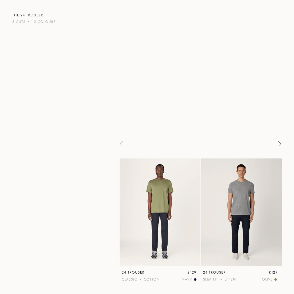
In restructuring the sitemap architecture, we prioritized a material-centric approach for each product, in line with Lestrange's commitment to quality and impact. Our efforts included implementing a clean tagging strategy, simplifying nomenclature, and establishing parent products.
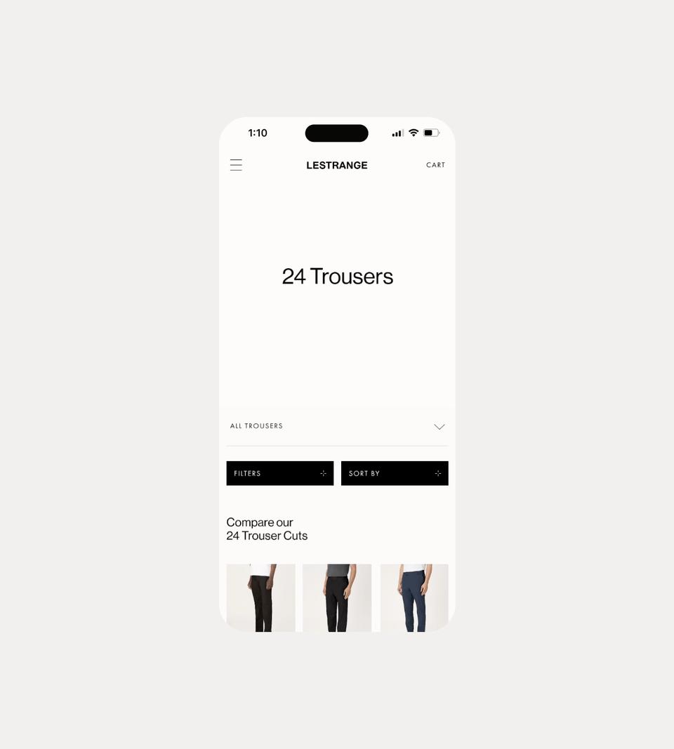
SKUs are organized throughout the website by two attributes: Style (Cut) and Material type. With limited seasonal launches and an unconventional product cycle, our user experience and content organization strategy was key to ensure freshness, newness and discovery while having clear and concise pathways.
THE ESSENTIALIST Designing a conversational tone for Lestrange's content series
We maintain an ongoing collaboration with Lestrange, conducting varied campaign launches to stress-test the parent Art Direction and pillars established in the new brand identity.

Our modular focus extends to the creation of a larger Art Direction framework, allowing unique launches and campaigns to coexist within the same ecosystem. We integrated sub-categories of art direction, considering elements like Science, Sustainability/Nature, Sports, Lifestyle and more.
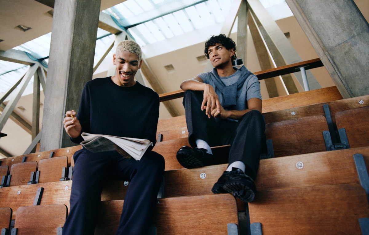
A/W CAMPAIGN 2023 Shot at a Crystal Palace Stadium celebrating spectactor sport and modernized varsity
SERVICES
CREATIVE STRATEGY
BRAND IDENTITY
UX
ECOMMERCE DESIGN
DEVELOPMENT
ART DIRECTION
PRODUCTION
INDUSTRIES
FASHION
ECOMMERCE
EASTERN RODEO WITH
BO YOON
Re_Fresh