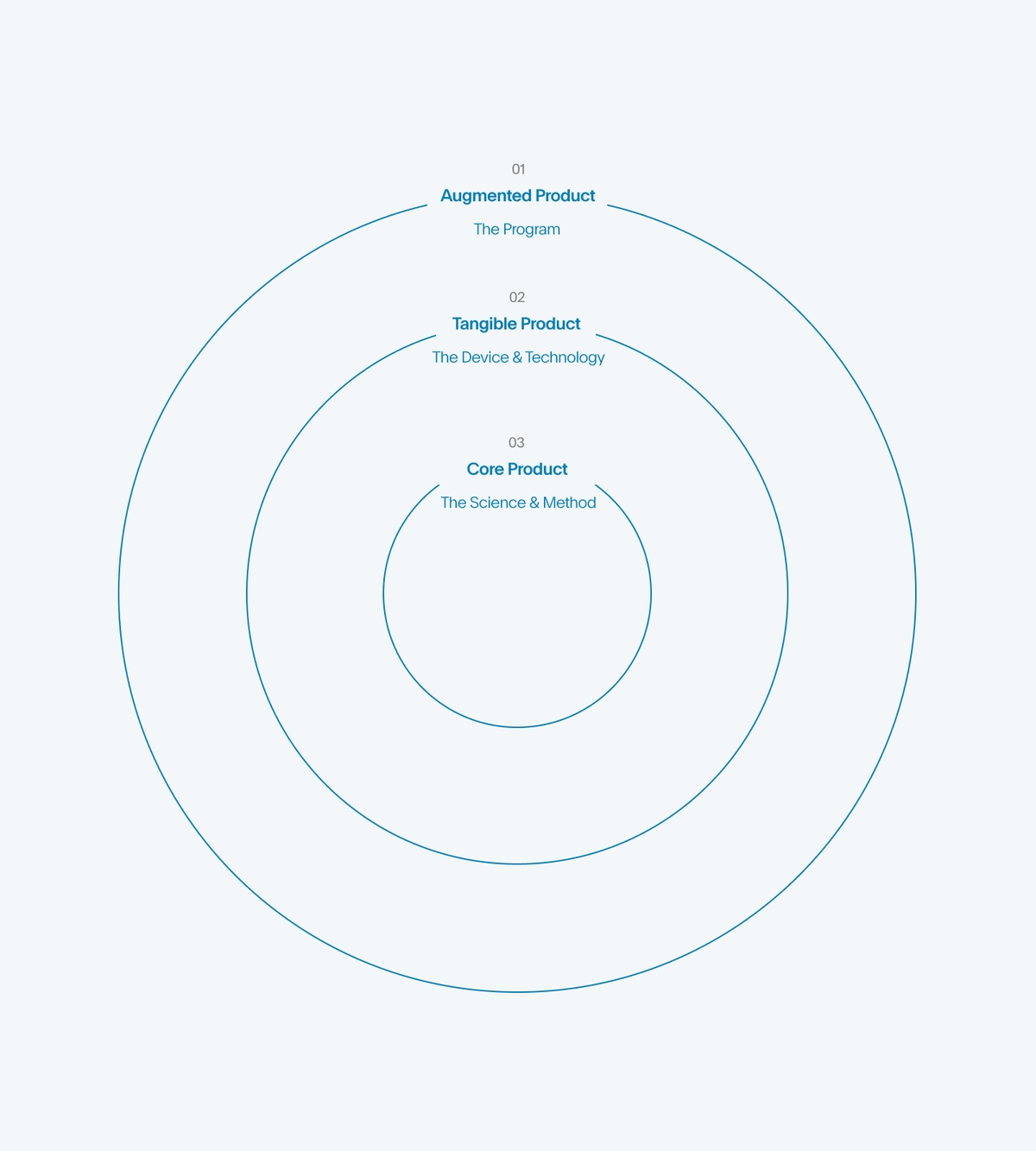
Our collaboration with Full Sleep involved developing a creative and messaging strategy to position them effectively in a tech-saturated market. We conducted extensive research, including stakeholder interviews, brand audits, user interviews, psychographic research, and competitive analysis, resulting in a consolidated creative strategy, positioning, and product communication approach. Working closely with Full Sleep during this pivotal stage allowed us to seamlessly integrate and represent the strategy in their brand identity.
Strategy Findings
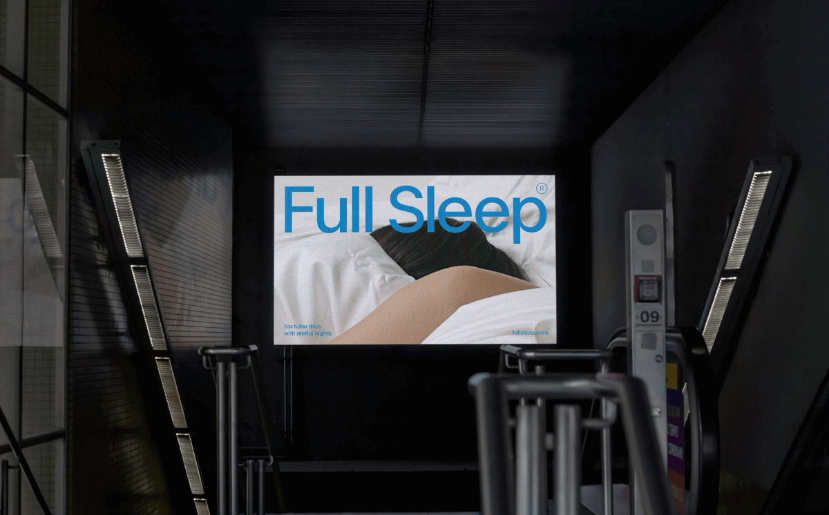
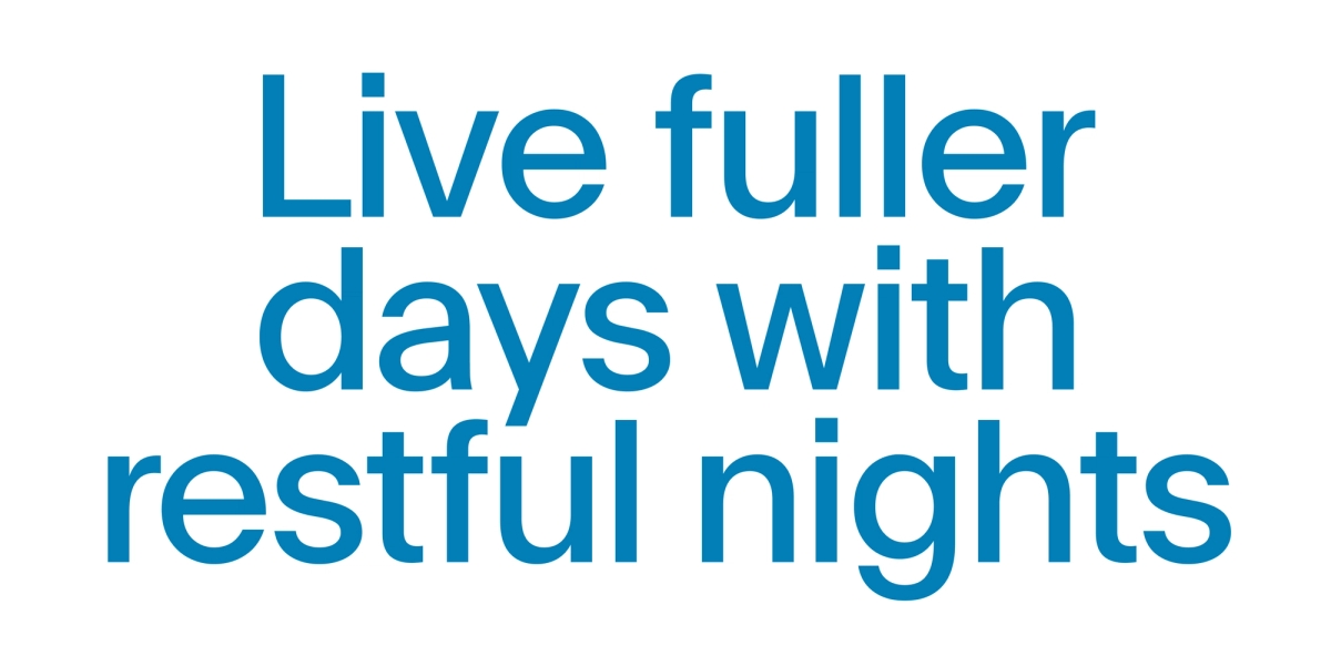
Our brand identity, inspired by the promise "Live fuller days with restful nights," focuses visually on the 'day,' a departure from the common night-centric approach in the sleep industry.
The intentional singularity and simplicity of the brand identity create a clutter-free experience, catering to accessibility needs, especially for an older demographic.
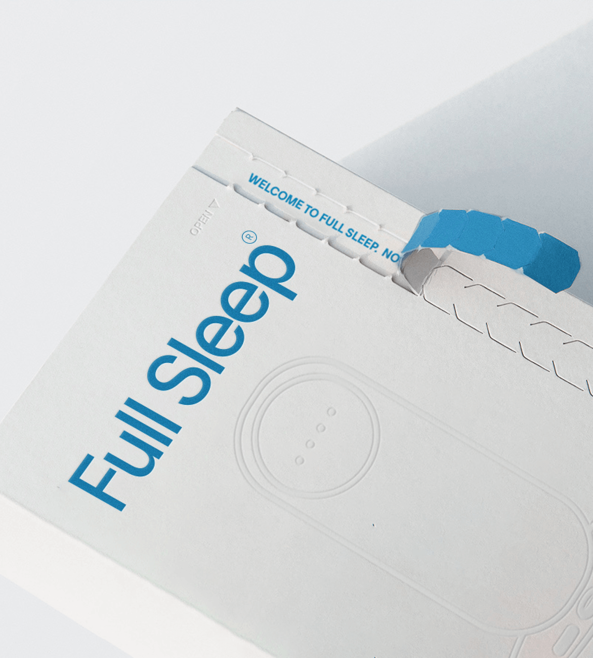
The use of one font throughout the system, and the logomark being set in the same manner emphasizes our decluttered approach to branding as well as sets the tone for a ‘program’ vs. a static brand application.
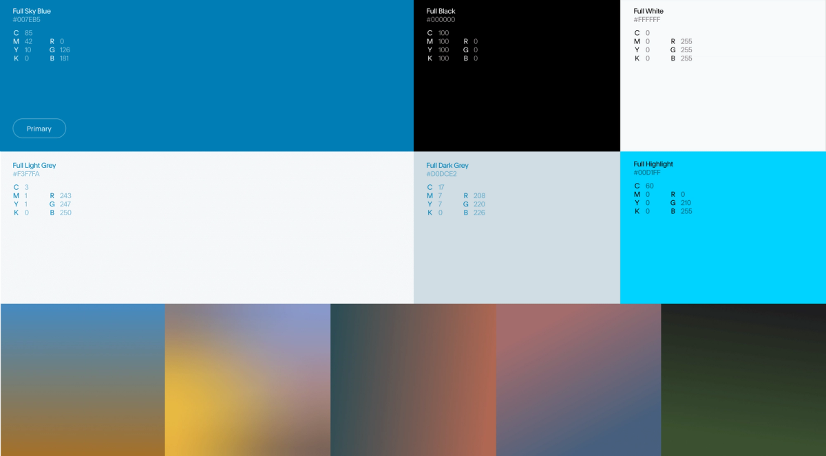
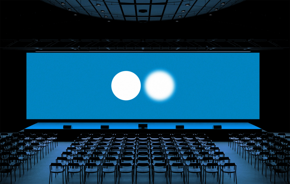
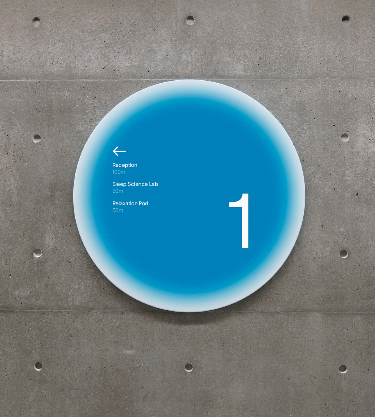
We maintain a singular approach in our colour palette, opting for a bright, authoritative blue associated with the 'day'. Supplementary gradient swatches represent different times of the day, enhancing time understanding throughout the experience.

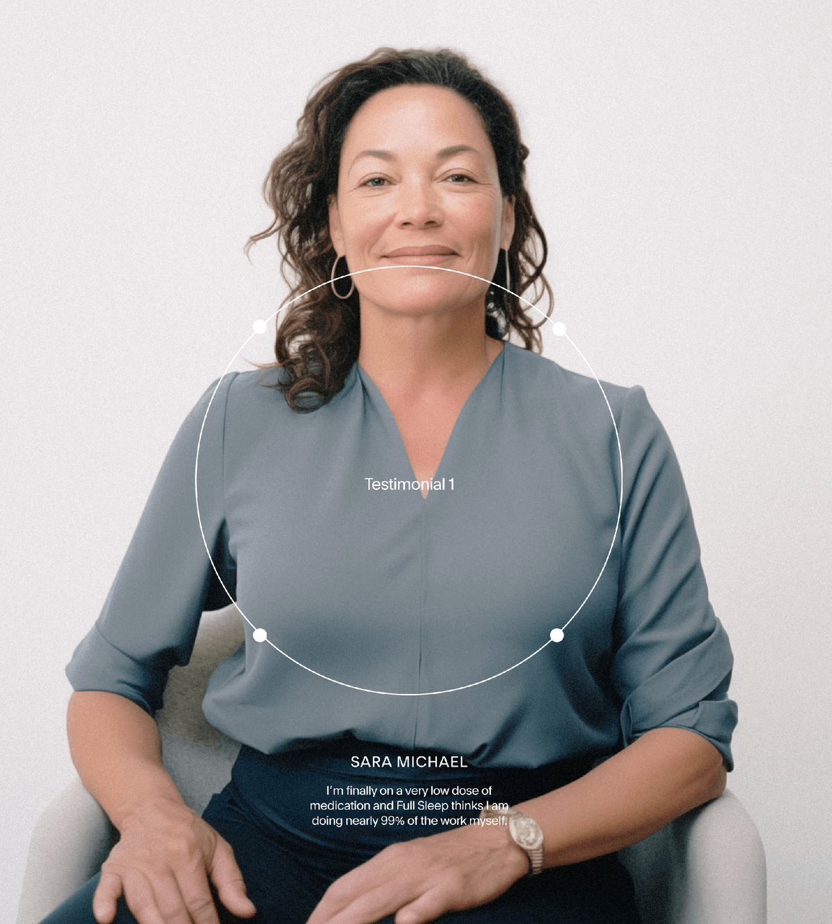
Extending this to our content and art direction, we highlight calming and scientific images, typically close-up, intentionally cropped compositions of nuanced moments. This ensures easy continuity of execution for Full Sleep internally to maintain the integrity of the look and feel.
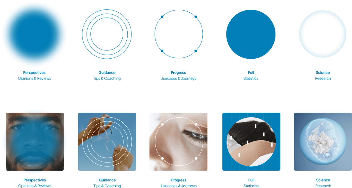
CONTENT ORGANIZATION SYSTEM
Animation is a core element to the new brand identity, providing a guiding and friendly tone within the digital product, and to intentionally offset the more scientific simplicity of other brand elements.

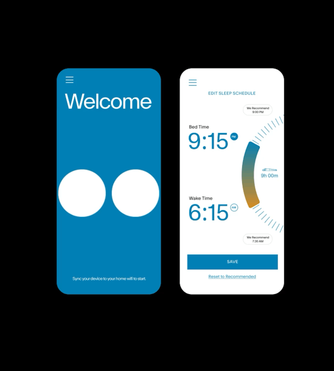
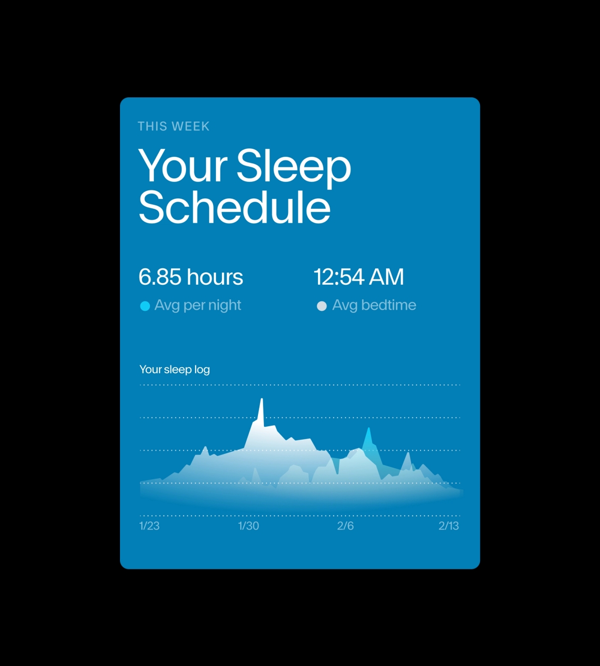

Adopting a design-led utilitarian approach to information display, our brand identity fluidly adapts to be applied to the digital platform, prioritizing universal design, clarity and ease of use.

SERVICES
CREATIVE STRATEGY
POSITIONING
NAMING
BRAND IDENTITY
PRODUCT APPROACH
INDUSTRIES
MEDTECH
SLEEP
SERVICES
CREATIVE STRATEGY
POSITIONING
NAMING
BRAND IDENTITY
PRODUCT APPROACH
INDUSTRIES
MEDTECH
SLEEP
EASTERN RODEO WITH
CLIENT: KOKO LABS
UX LEAD: IVY HU
Cabi