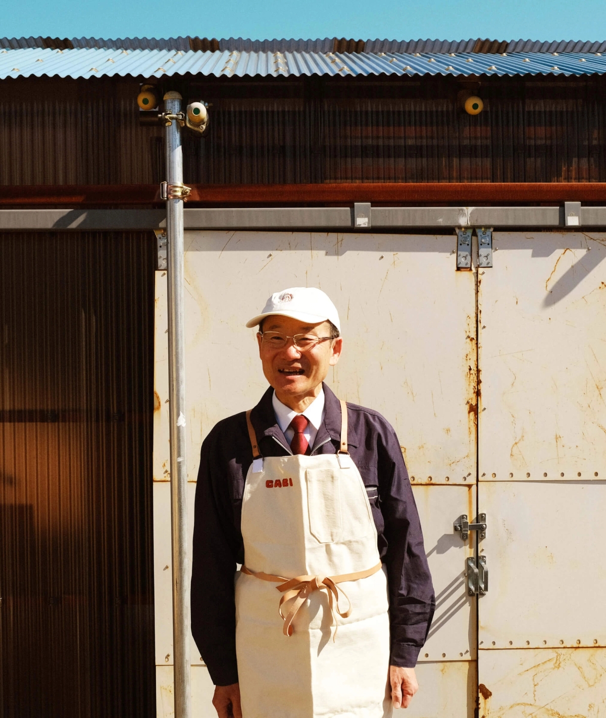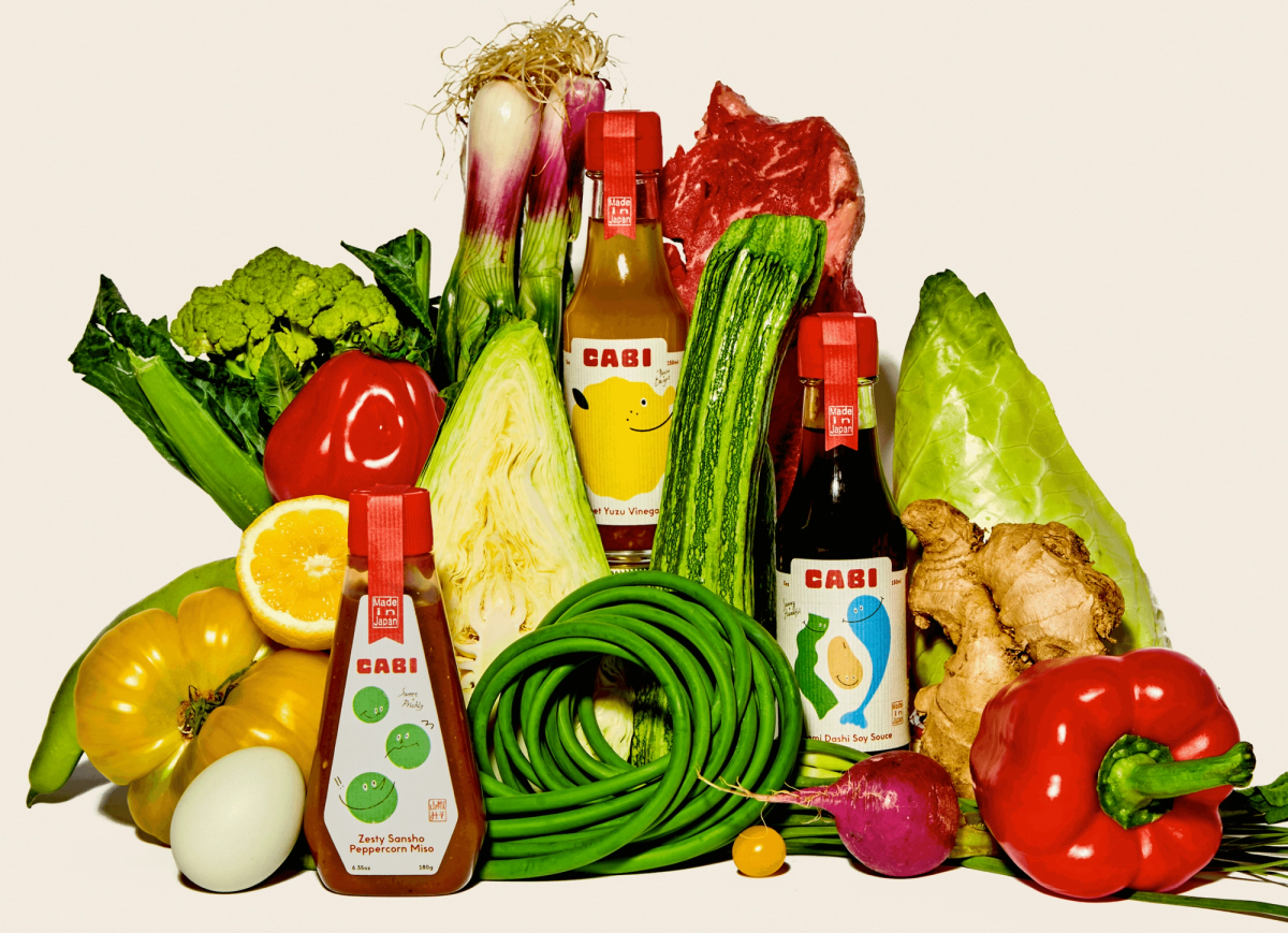
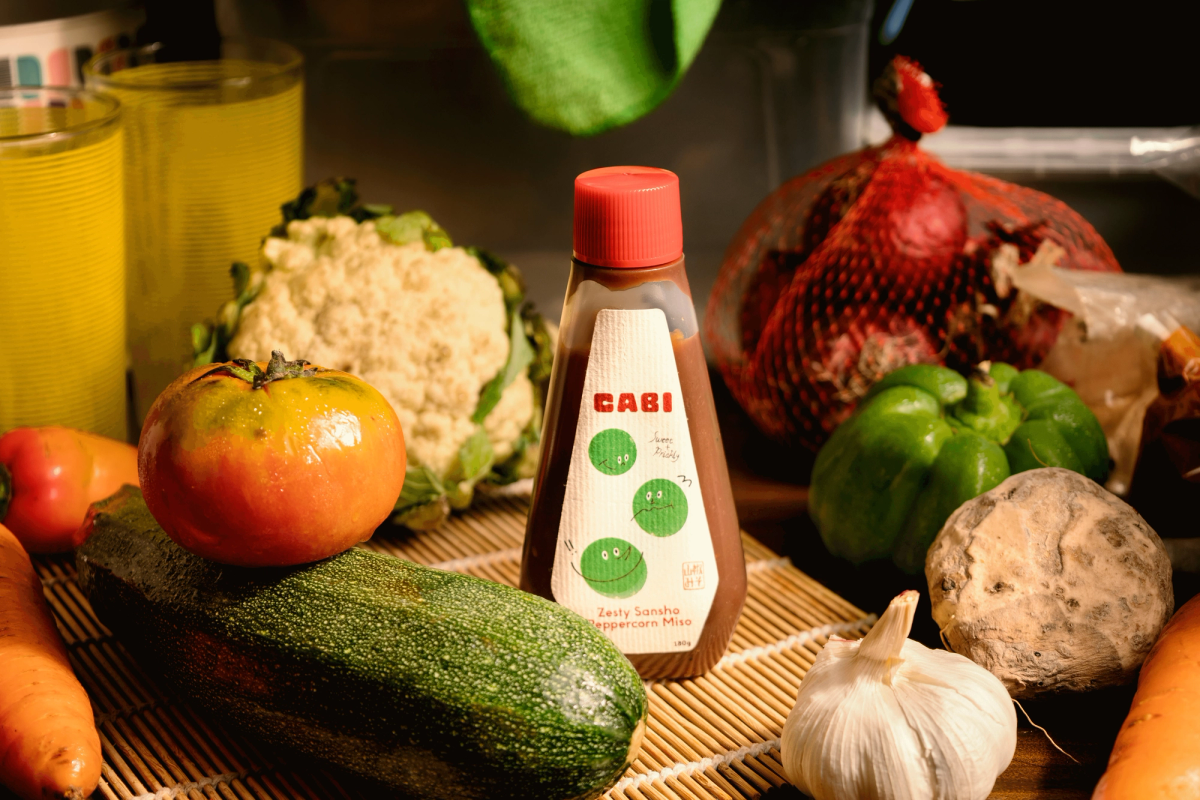
The birth of Cabi came from a simple market understanding: a gap in the market for easy-to-use, easy to understand high quality Japanese products that uphold traditional techniques while bridging the understanding gap faced with existing complex specialty products.
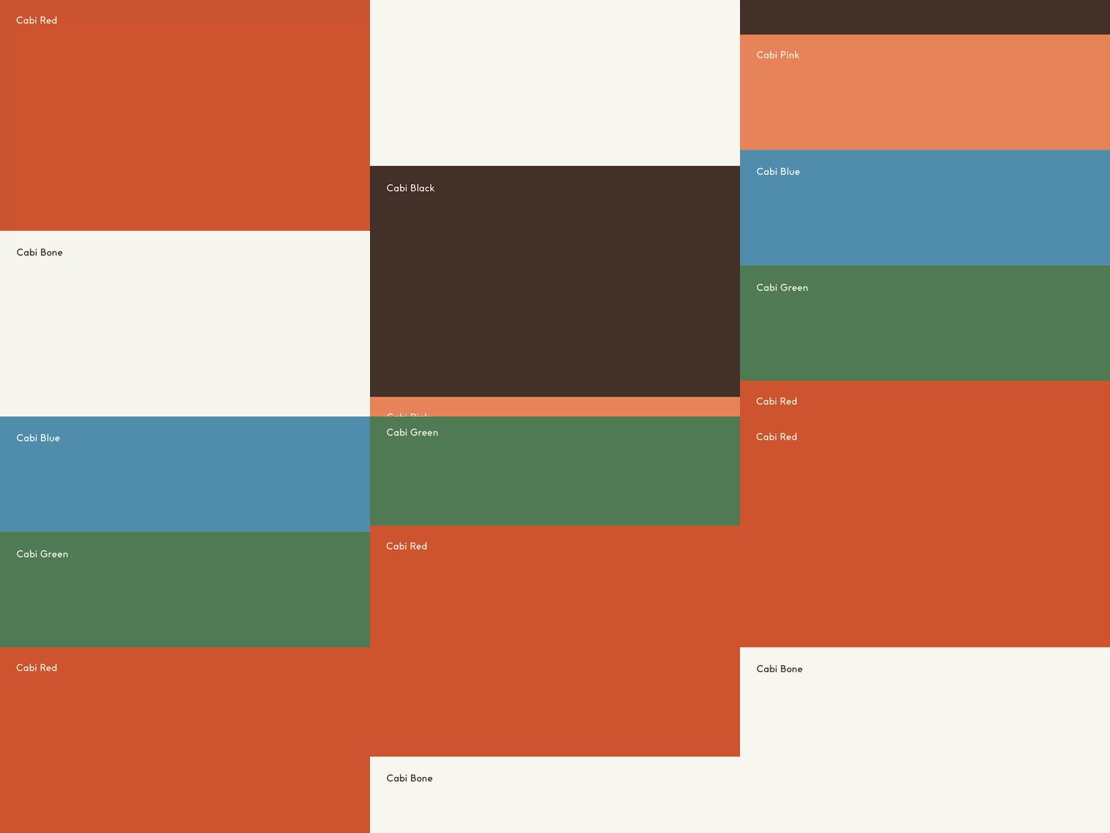
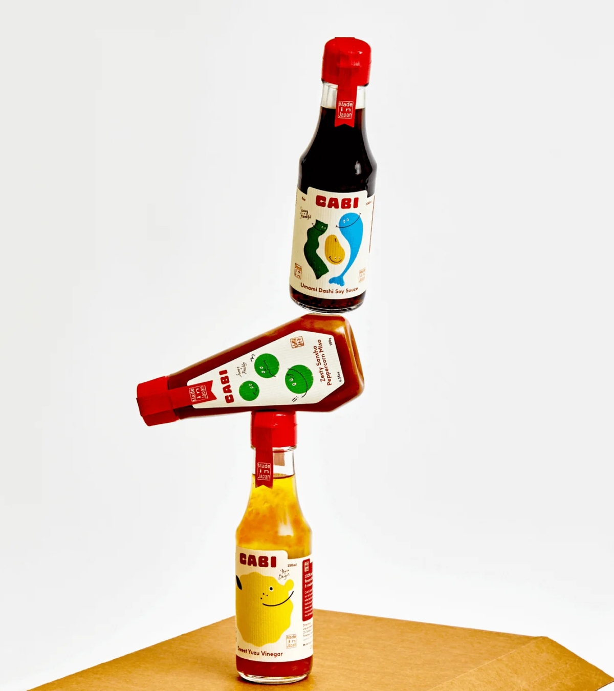
Finding harmony between approachability and the upholding of traditional techniques, the brand identity of Cabi has been designed to feel that nothing is out of reach. Our brand approach is a confident blend of these notions, focusing on the personification of these core flavors and ingredients spotlighting product quality & ease-of-use.
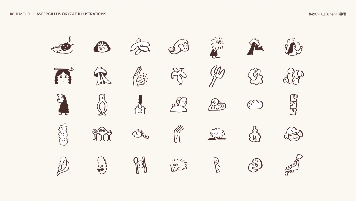
ILLUSTRATION Character based illustrations to simplify concepts like 'Koji Fermentation'
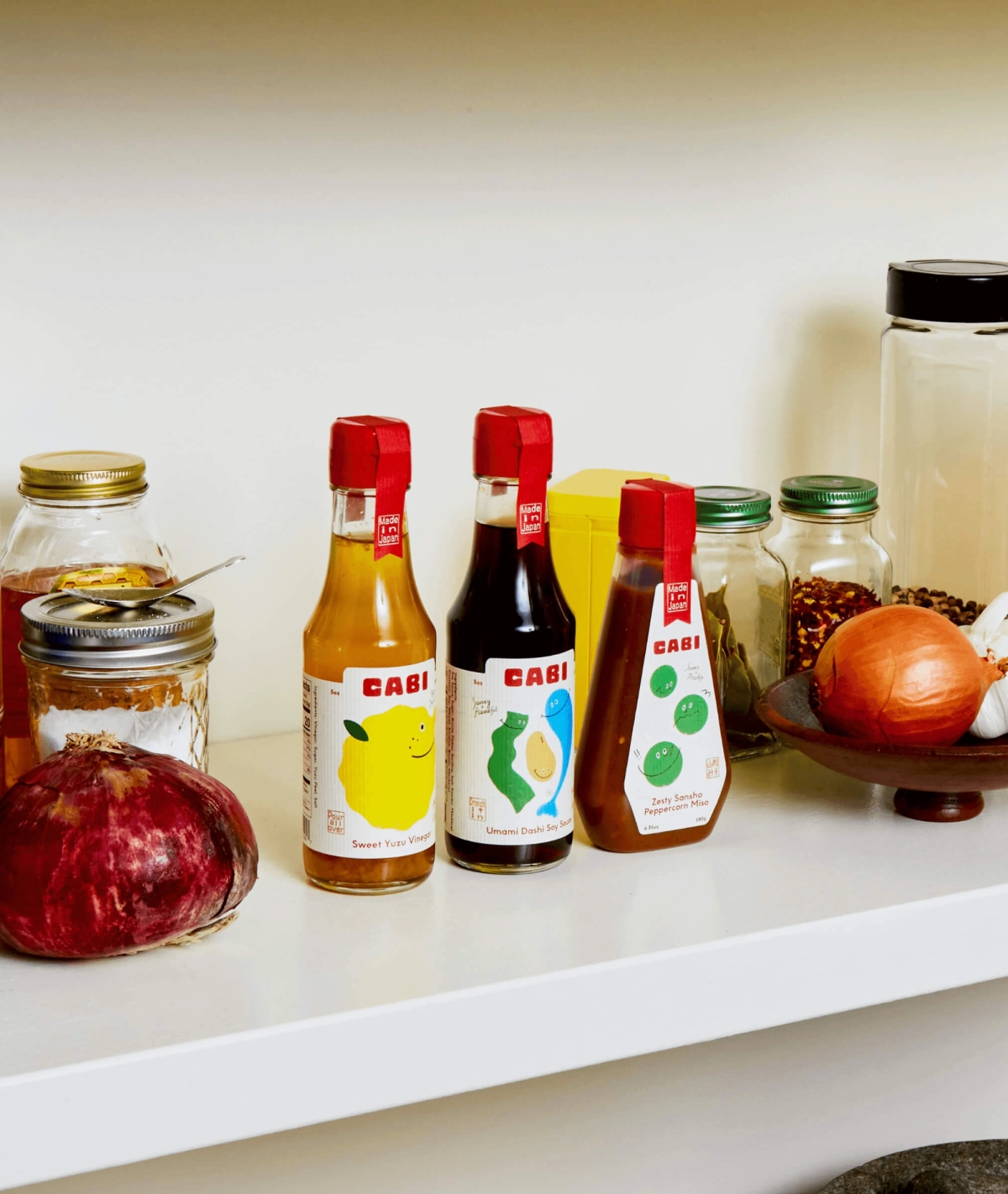
The Cabi original trio, features distinct playful characters representing each product type. The brand identity carries a big load in this way, in ensuring quick understanding and recognition of product use and type within a saturated, CPG market.

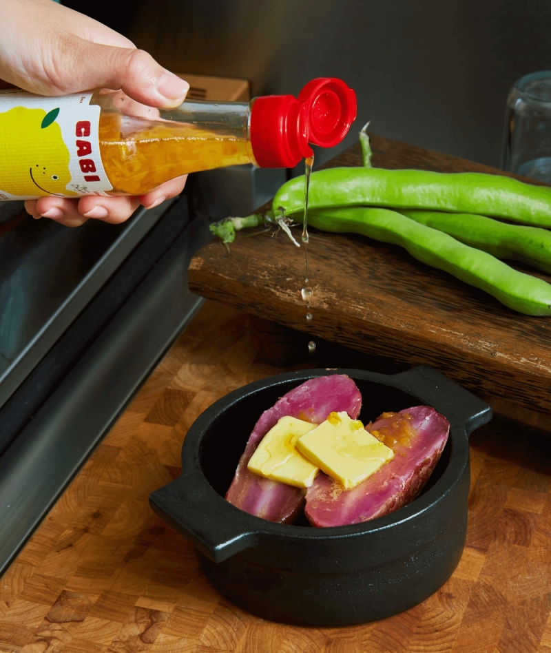

Messaging forms an important piece of Cabi. Not only in the brand voice, but in writing for education. The complexity of the Japanese food market can be daunting for non-Japanese speakers, and our aim was to streamline product communication. Messaging for Cabi leads with product-first, supported by the brand voice. Communicating in punchy ways, we create familiar comparisons with easy to understand tastes and examples.
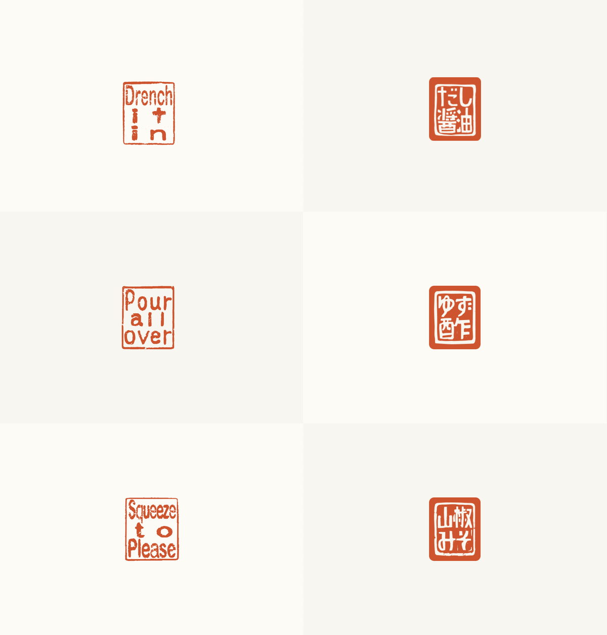
COPY INFORMED DESIGNS An Instructional spin on traditional stamps
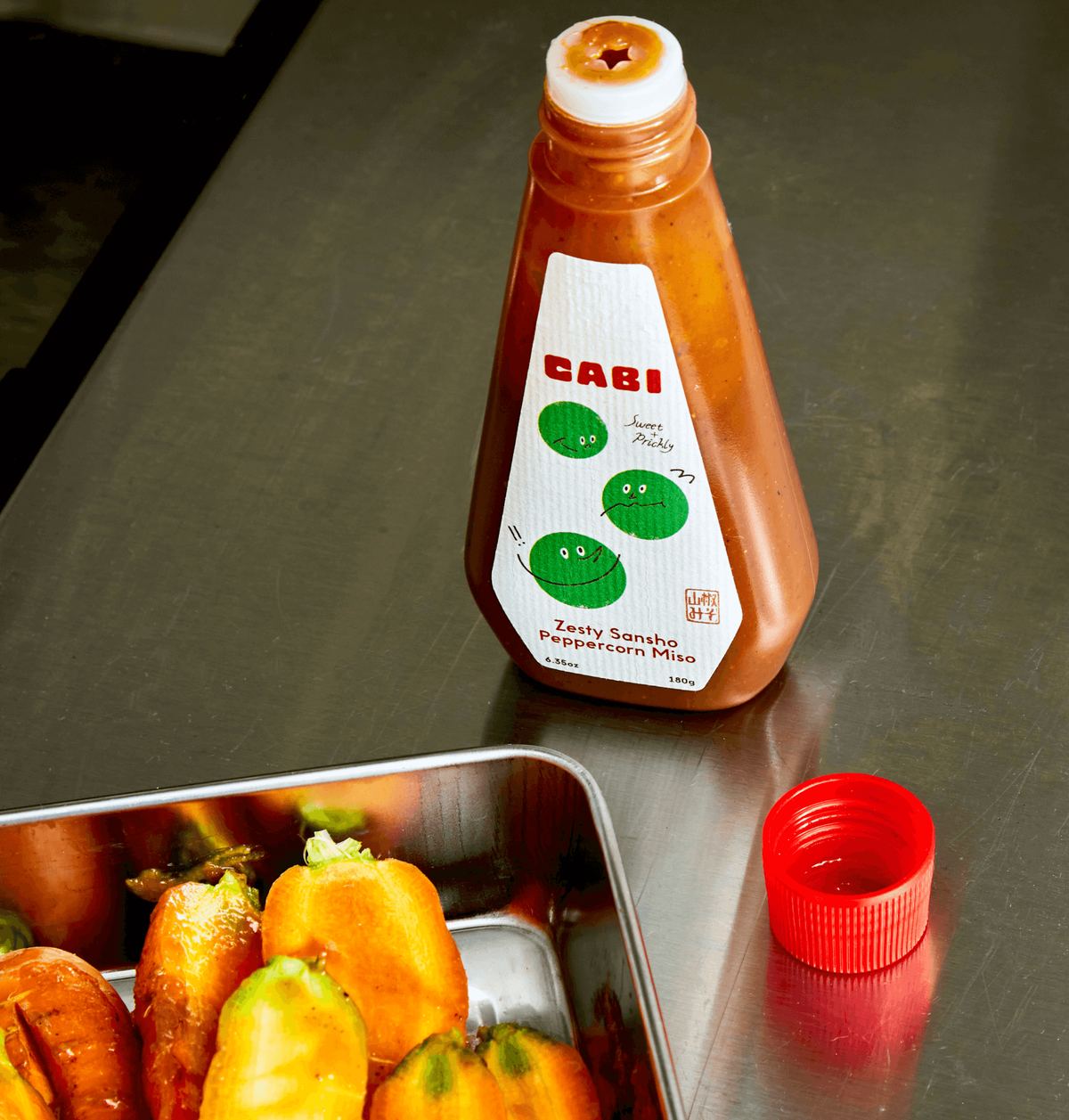
COPY INFORMED DESIGNS Stamps in use on the label
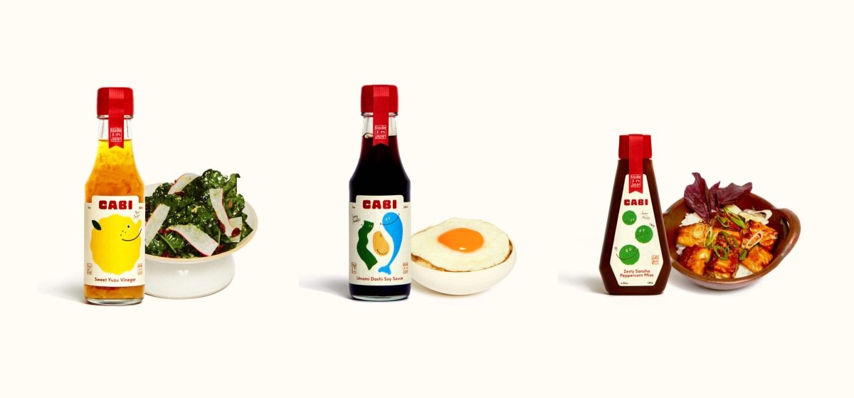
The packaging of the Cabi trio plays on traditional and familiar tropes of Japanese and Asian packaged goods with a simple red bottle cap, washi paper and custom labels personifying key ingredients and product types. We worked with Japan based suppliers to manage production and manufacturing of these pieces.
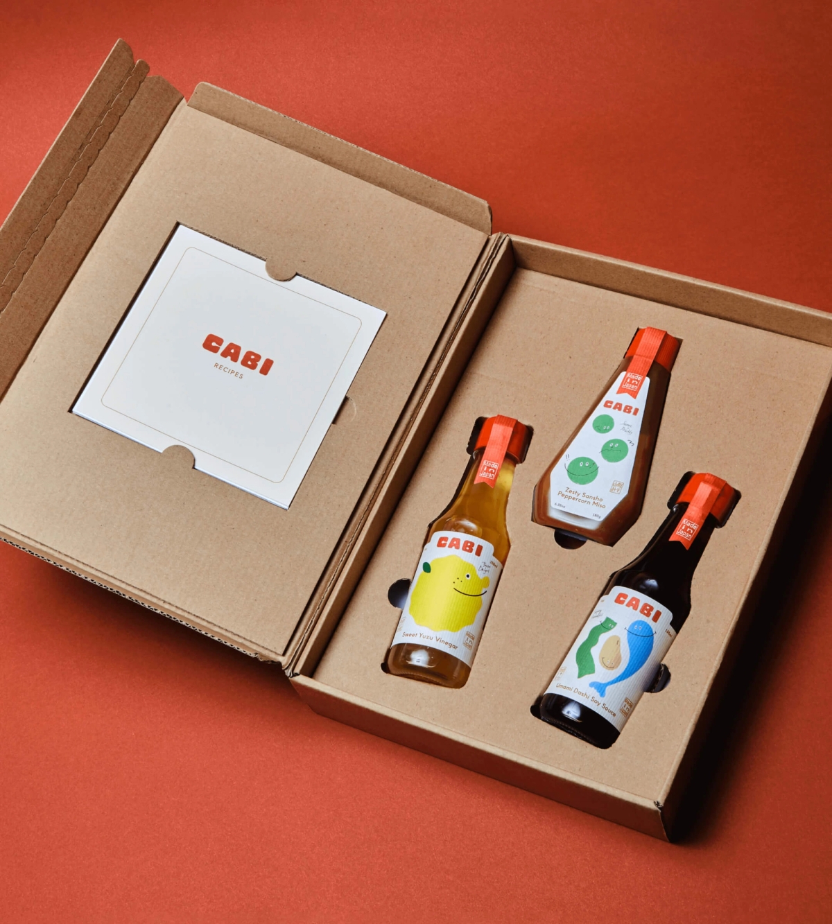
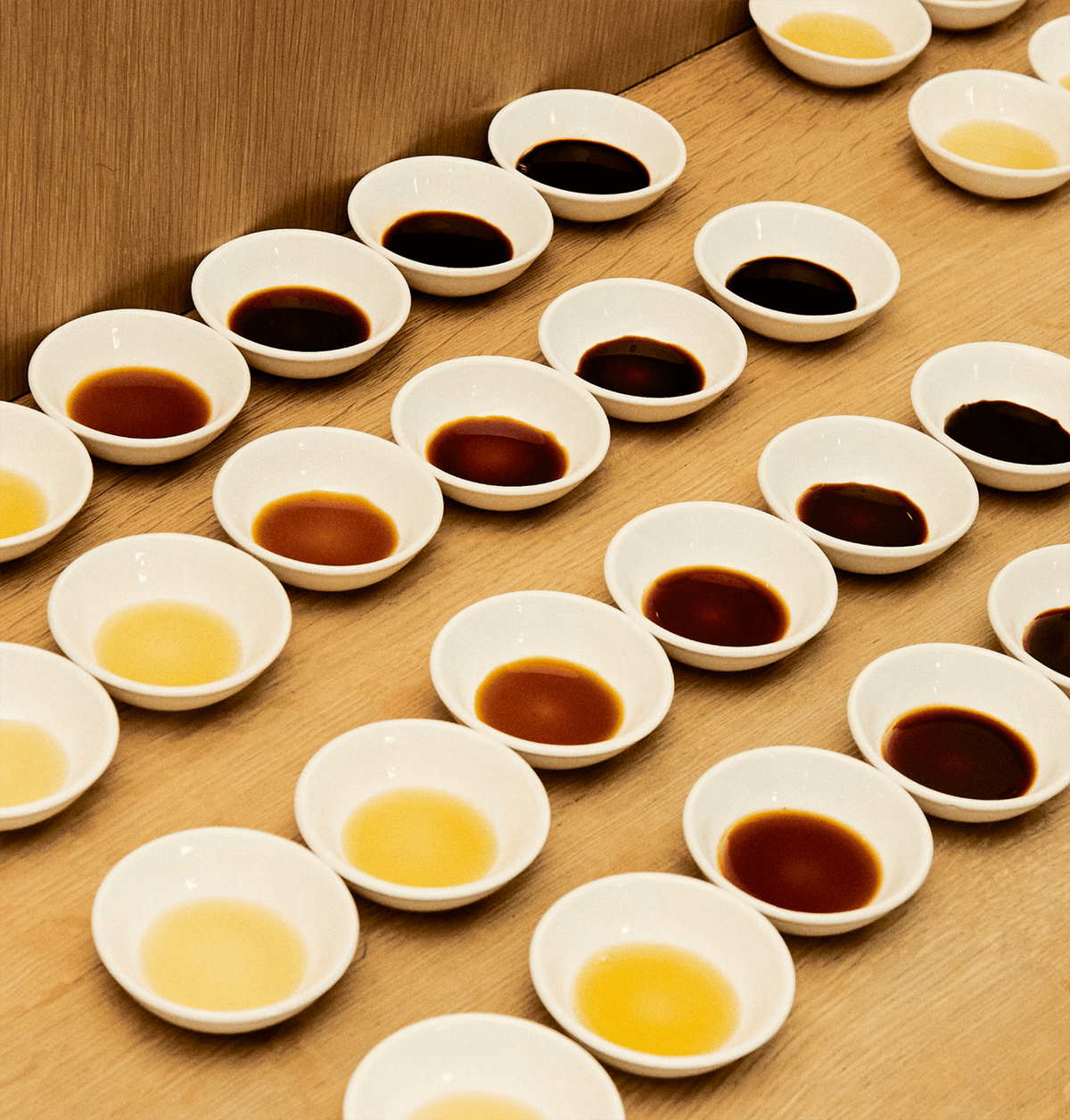
Special editions feature traditionally-anchored packaging types such as furoshiki wraps. The brand identity also flexes to accommodate new packaging styles and launches within the Cabi brand as seen with our the Soy Sauce Tasting Palette, a more premium product of Cabi.

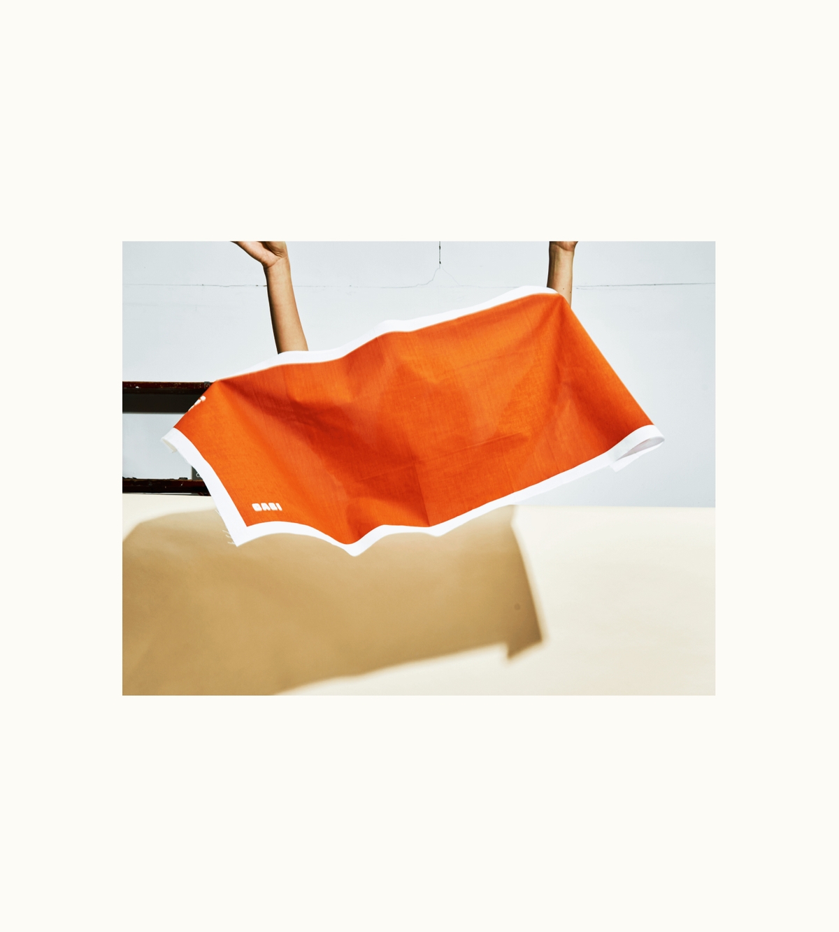
Photography is an area of Cabi that we take great pleasure in, enabling us to collaborate with photographers we admire to form unique visions for launches, events and content series.
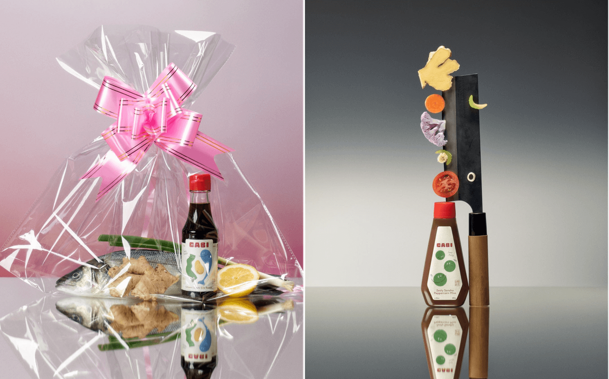
VALENTINES DAY SERIES 'Love Languages'
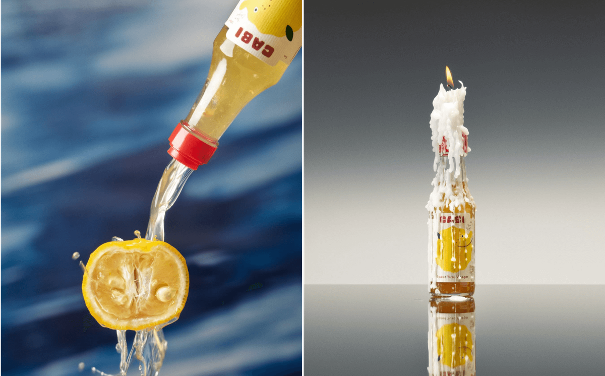
SHOT BY Corey Olsen
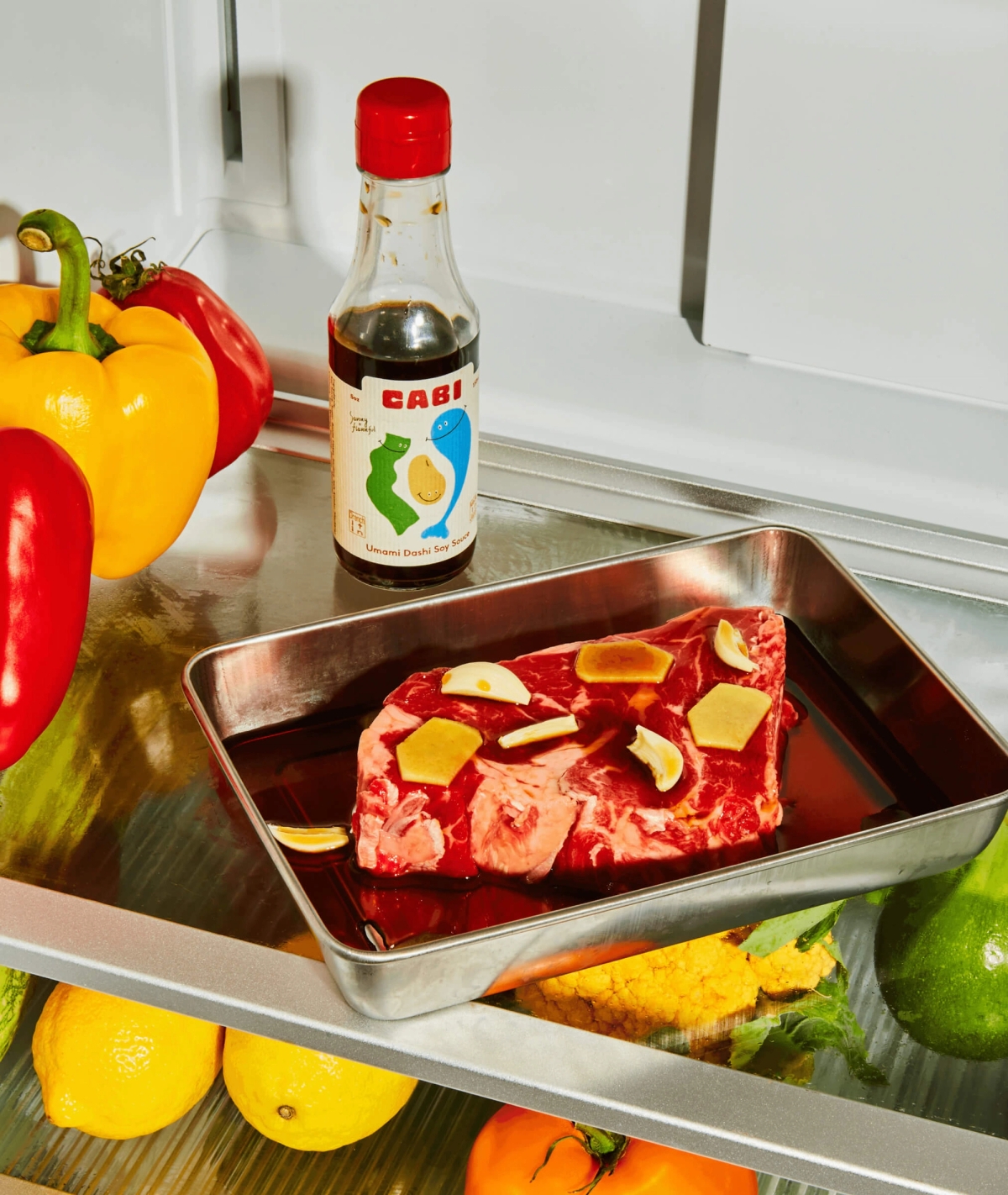
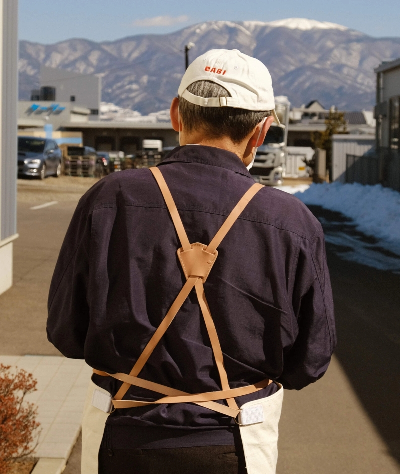
Photography for the Cabi brand is also done internally, in-house, by Eastern Rodeo approaching a range of photography styles and production setups. This allows content creation to be fluid, and hands on, allowing the portrayal of the backend process/methods of products to further storytelling.

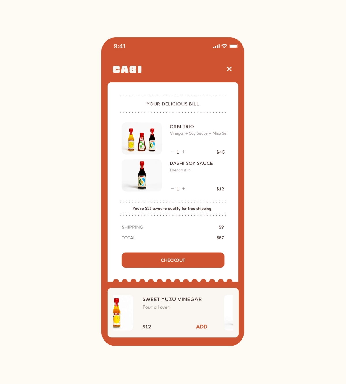
The Cabi ecomm experience is streamlined and simple focusing on communicating the feeling of tactility in the kitchen. Featuring a systematic appearance of rounded edges made to be reminiscent of recipe cards and kitchen notes, this blends cohesively with the Cabi recipe index, a large portion of the website housing Cabi specific recipes which can be saved.
CREATING A CONTENT PLATFORM Over 100+ unique recipe videos and content pieces were shot and edited for Cabi's recipe index
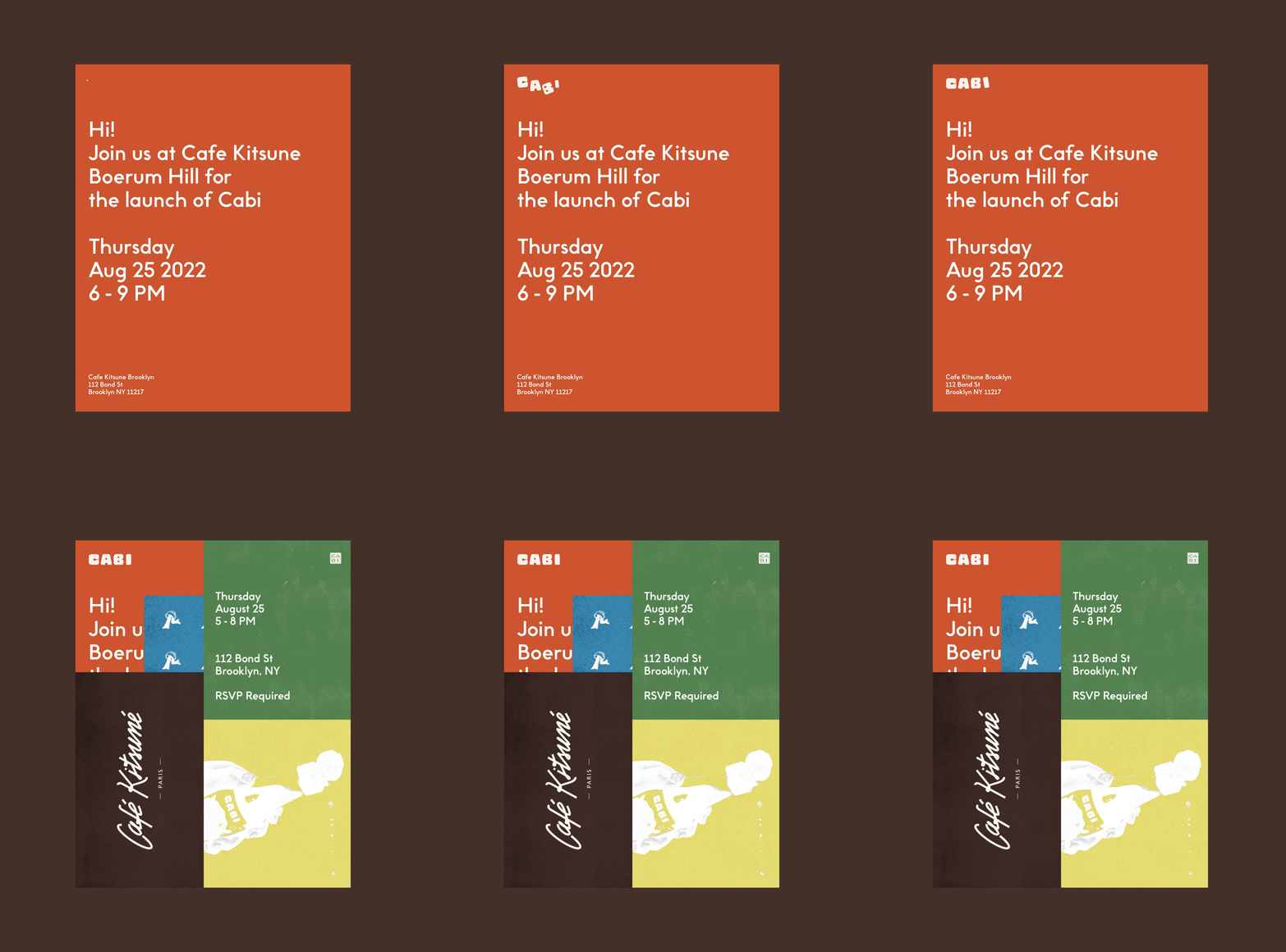
In addition to ongoing marketing efforts, event production is a large part of the community-driven initiative of Cabi in effort to shed light and education on Japanese home cooking and ingredients. Some of our recent events include: a 2 part soy-sauce making and fermentation workshop with the Ace Hotel and a camping & cooking weekend away with Snowpeak.
