
Our brand approach elevates the original brand using minimal elements, situating it within the universe of luxury fashion. The new identity is type-led and thoughtfully pared-back and facilitates functionality between the two key services, fostering collaboration and upselling opportunities.
DISTINCTION BETWEEN SERVICES Production & Studio Rentals

Focusing on editorial type lockups that continually get used throughout the system— these lockups serve as distinctive, branded stamps unique to Lock Studios and were conceptualised to be reminiscent of luxury printed address stamps, and old letterheads.
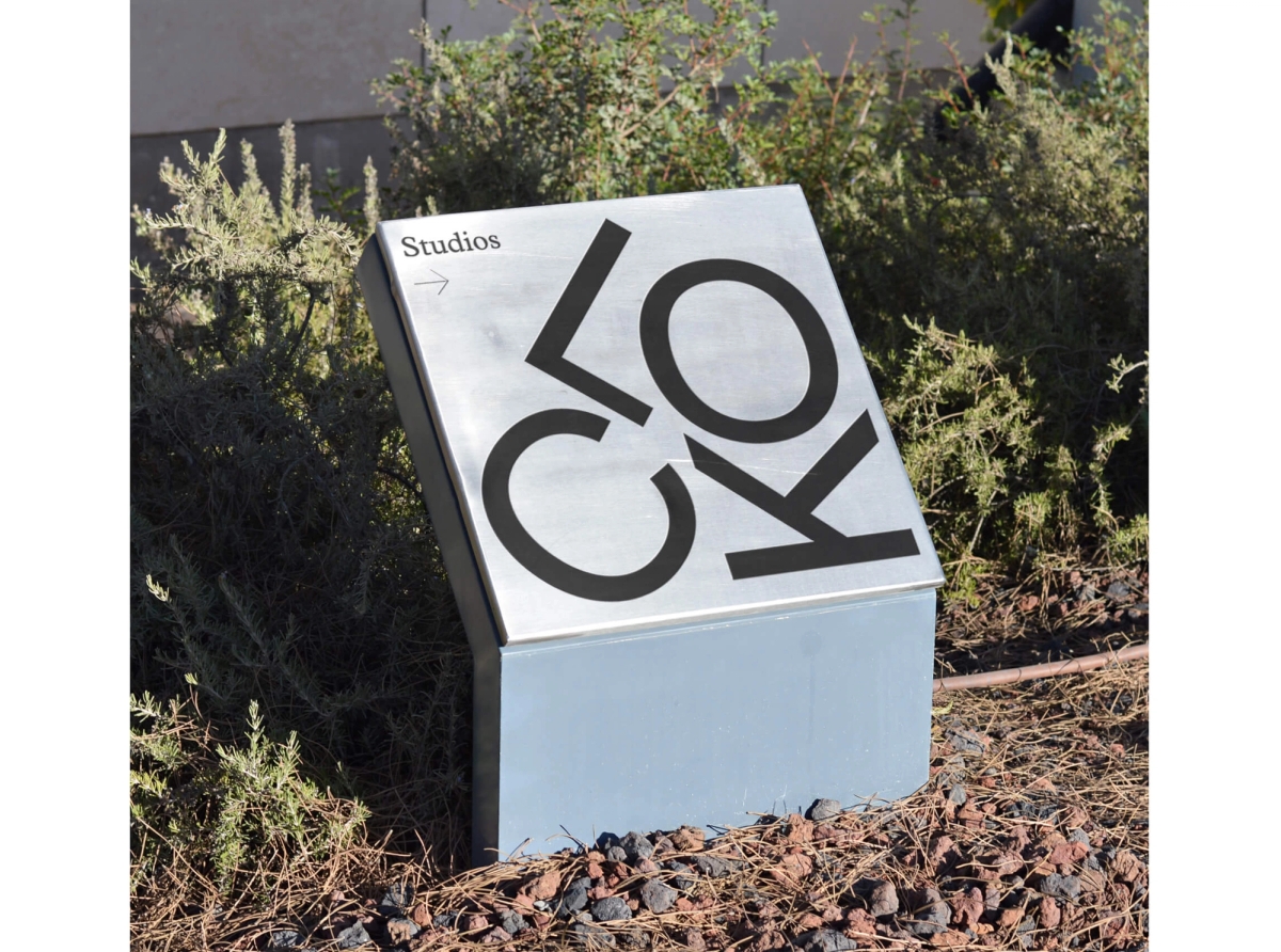
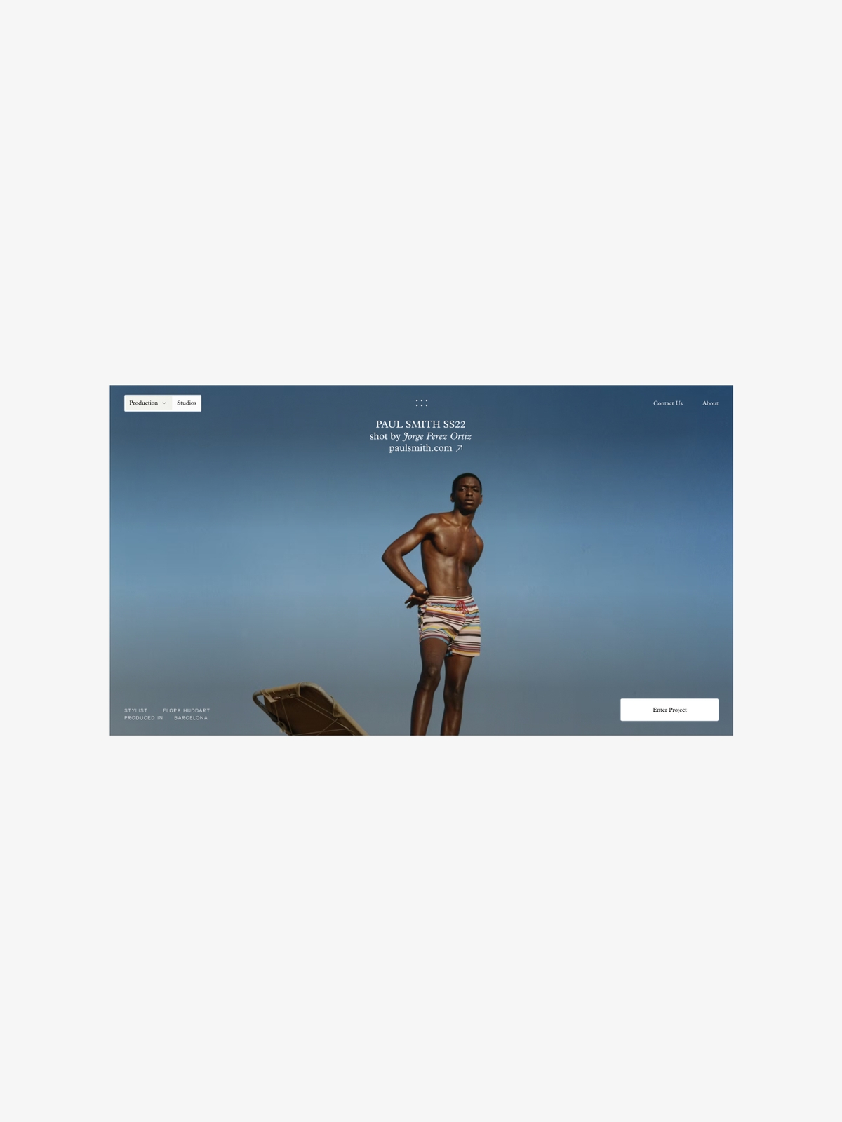
Location lockups were crafted as logos for each location embodying a unique identity while maintaining unification. Playing on the concept of ‘lockup’ — the Lock logo in its stacked secondary form directs the continued visual language for each location logo under the same umbrella. These contrast against the more structured nature of type seen within the brand identity.


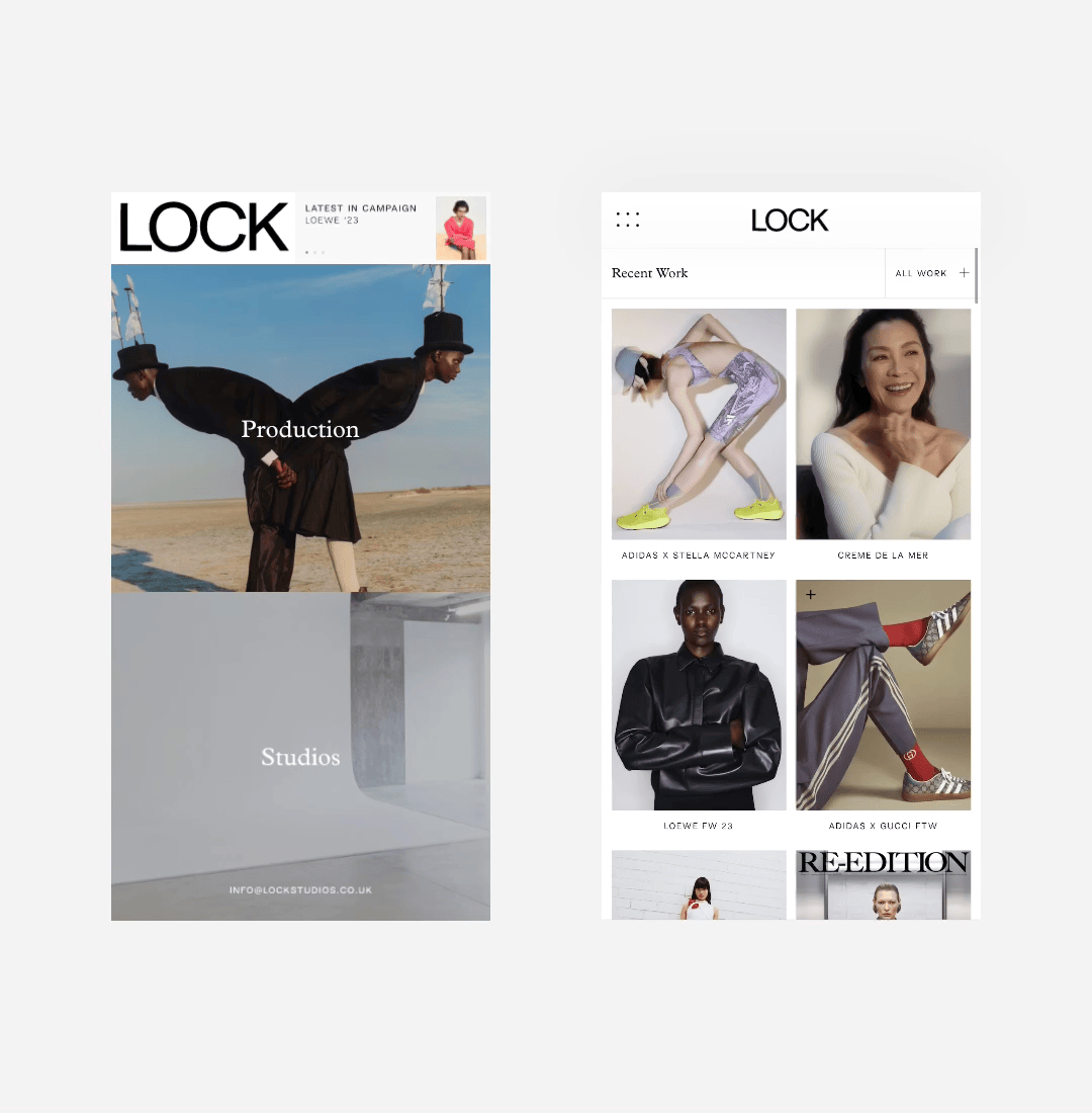
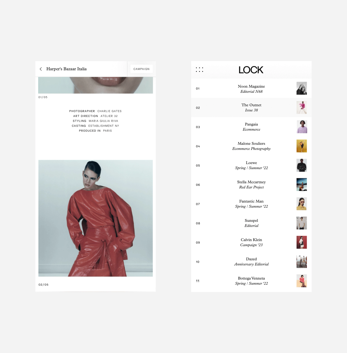
Our restructuring and strategy for Lock Studio’s website highlights a mirroring between their two offerings, with UX decisions to split the website, almost like two doors into the same framework, while offering universal methods to toggle between the two at all times.
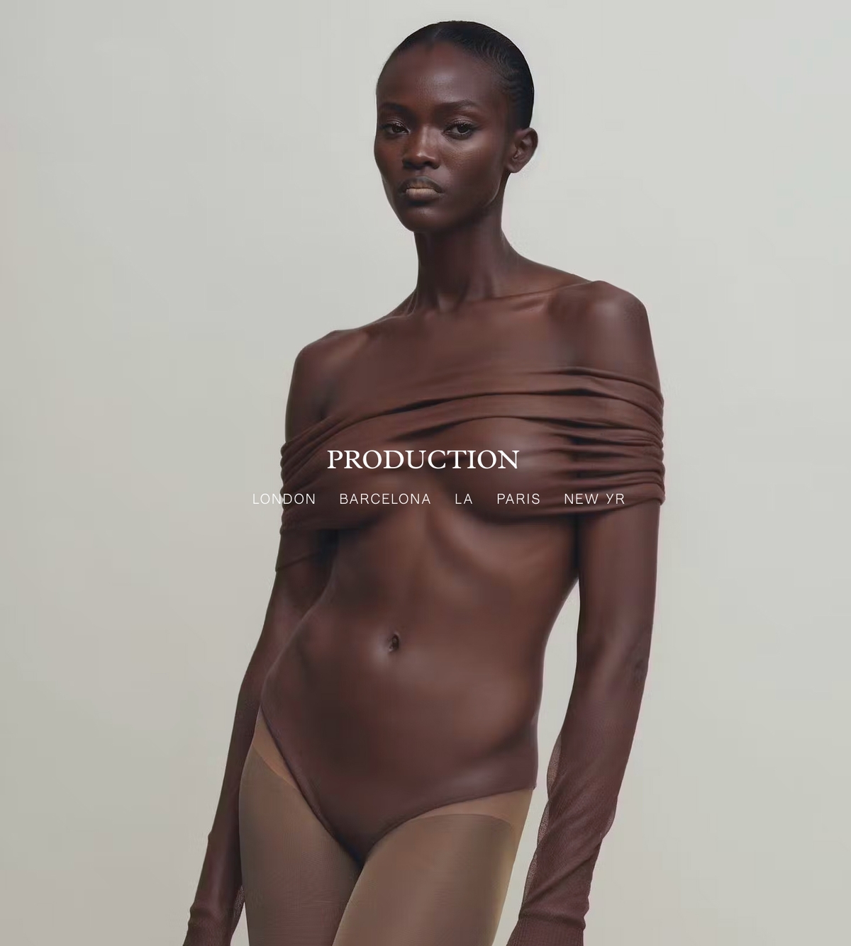
PRODUCTION & STUDIOS Two paths in
Embracing the essence of its name, the Lock logo transforms through animation ‘locking’ into place and creating an anchorage point for the brand experience.


SERVICES
CREATIVE STRATEGY
BRAND IDENTITY
WEBSITE DESIGN
DEVELOPMENT
INDUSTRIES
FASHION
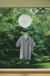
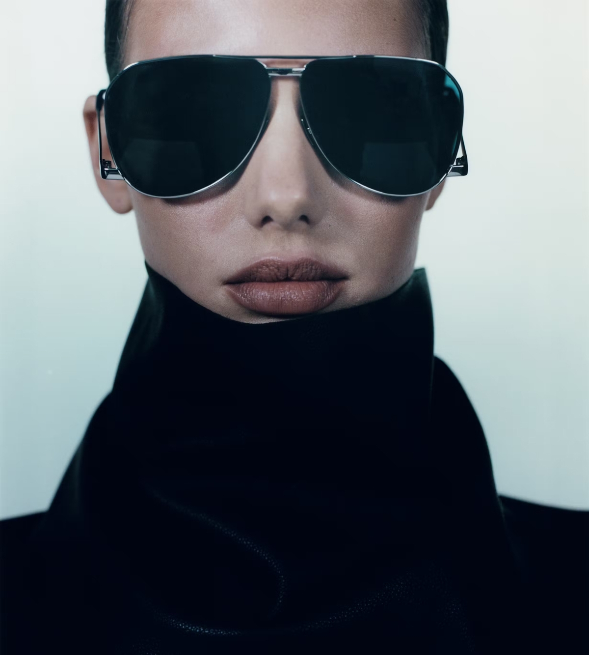
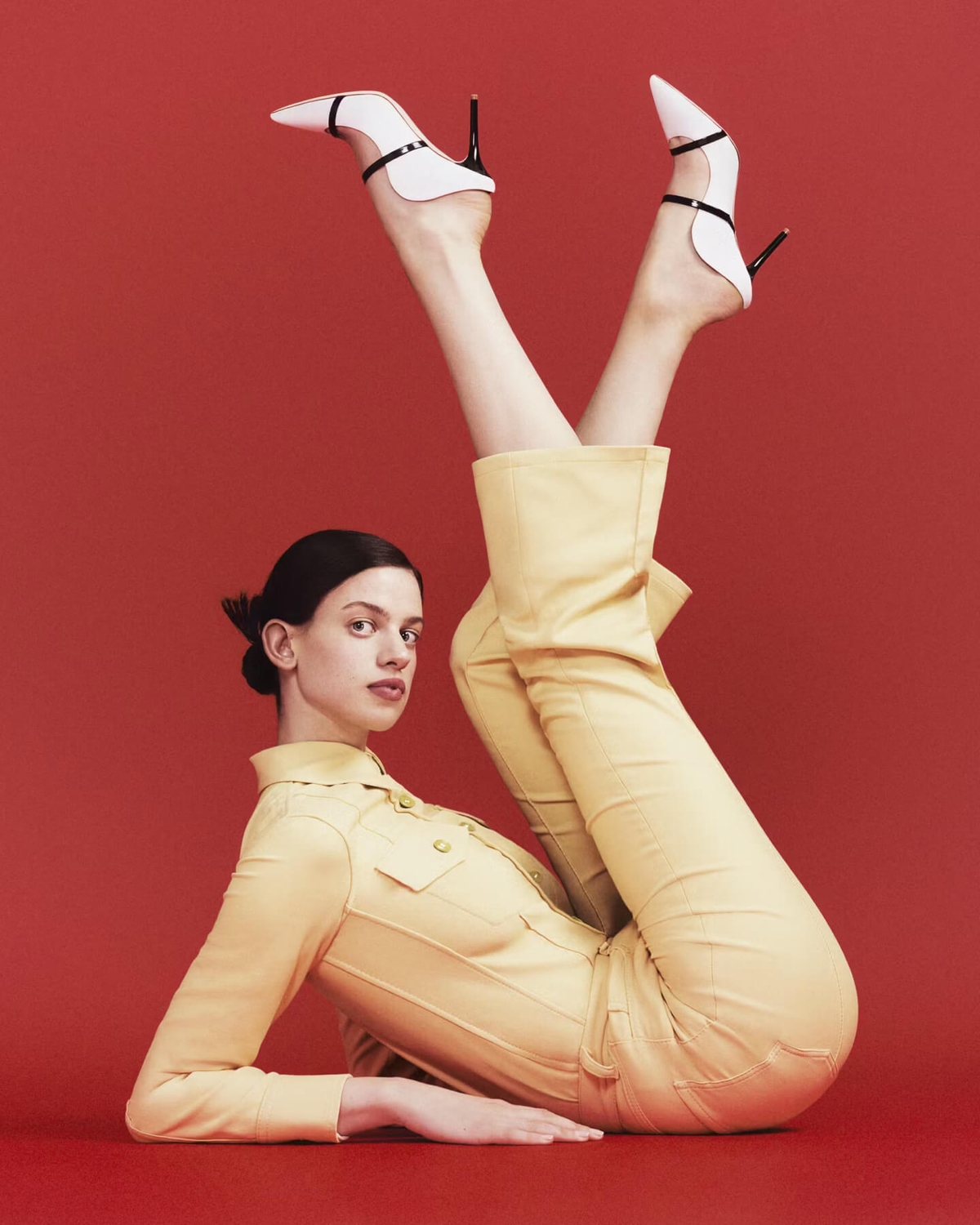
PRODUCTION
EASTERN RODEO WITH
BO YOON
DIGBY BAER
MUJI